IPA Label Design Series
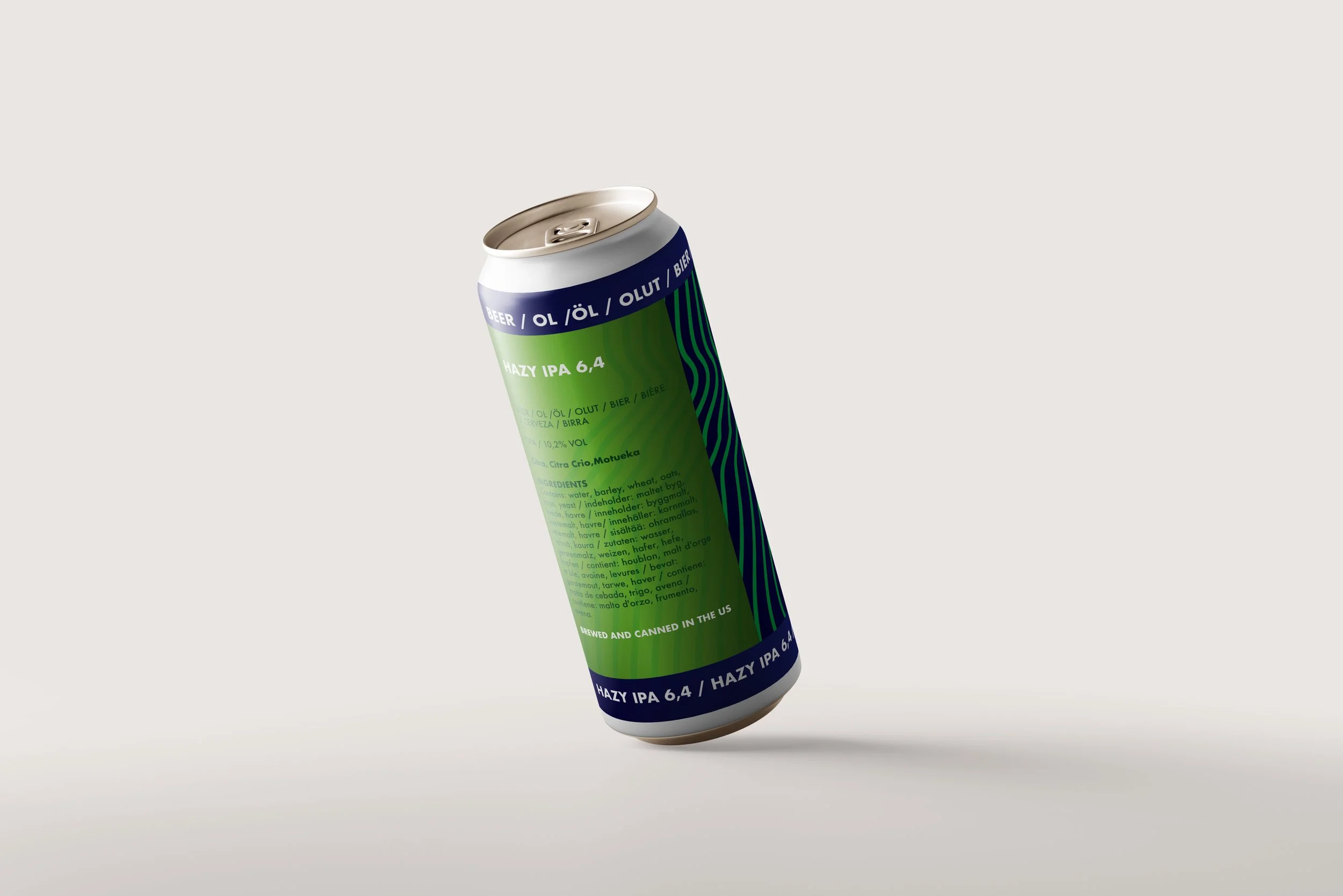
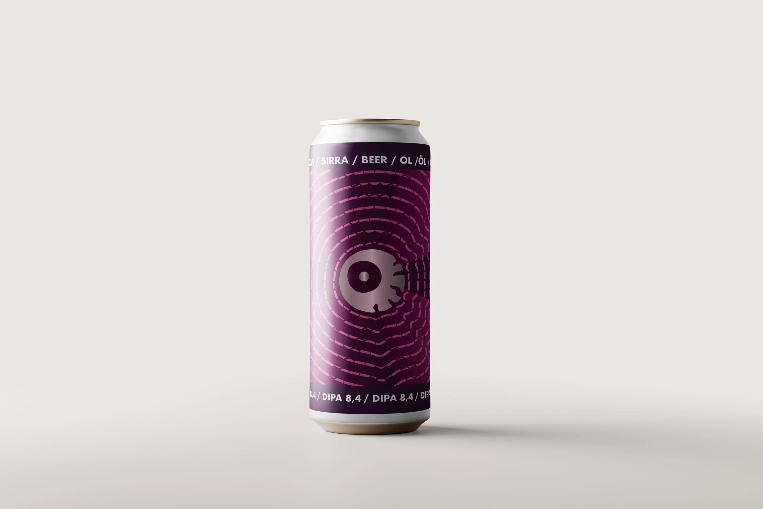
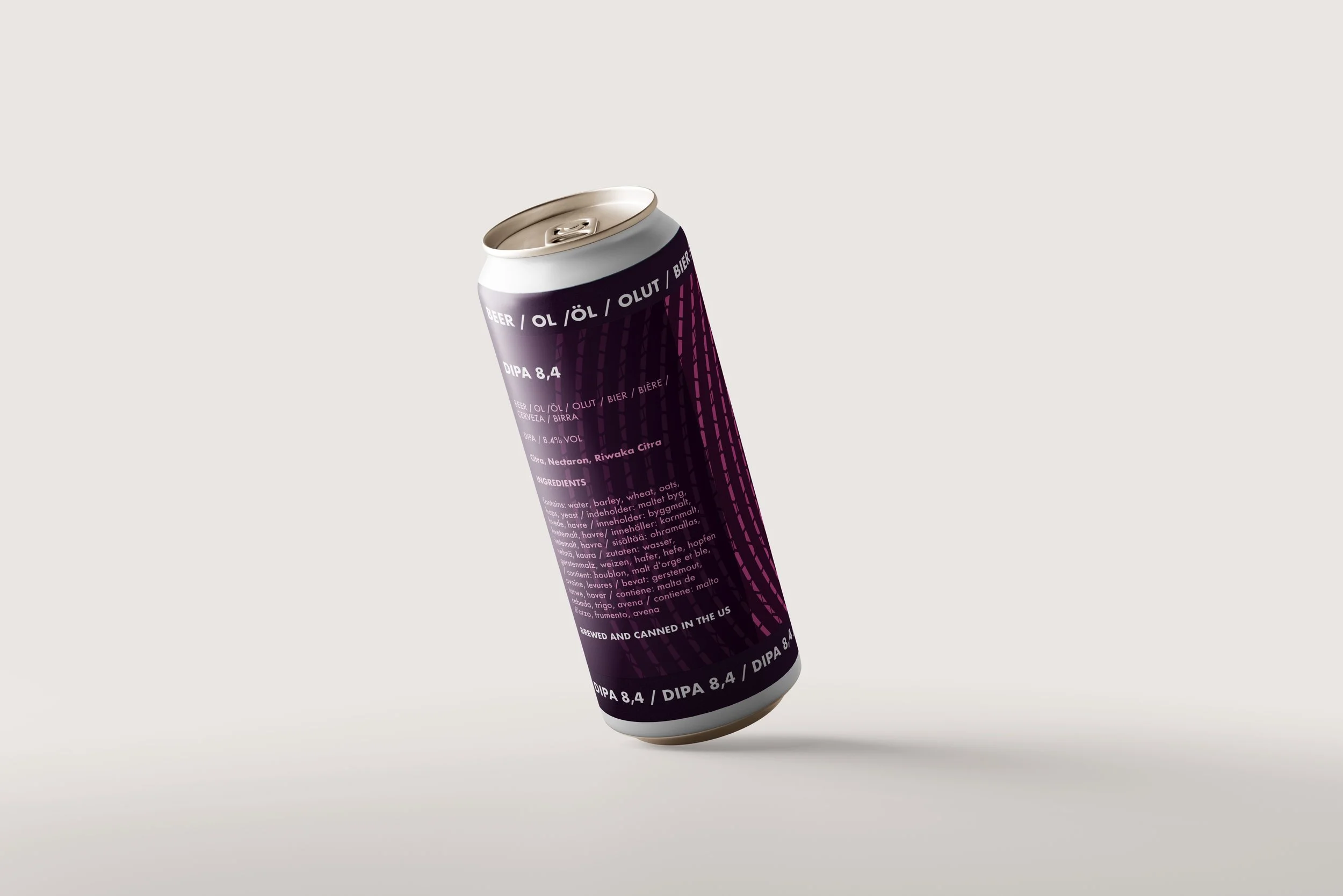
IPA Label Design Series focused on creating custom labels for three bold varieties: Hazy IPA, DIPA, and TIPA. Each label was crafted to visually reflect the unique flavor profile and intensity of the beer it represented — from the smooth, cloudy character of the Hazy IPA to the punchy richness of the TIPA. The designs were aligned with the brand’s overall concept, aiming to deliver a visual experience as distinctive and memorable as each sip.
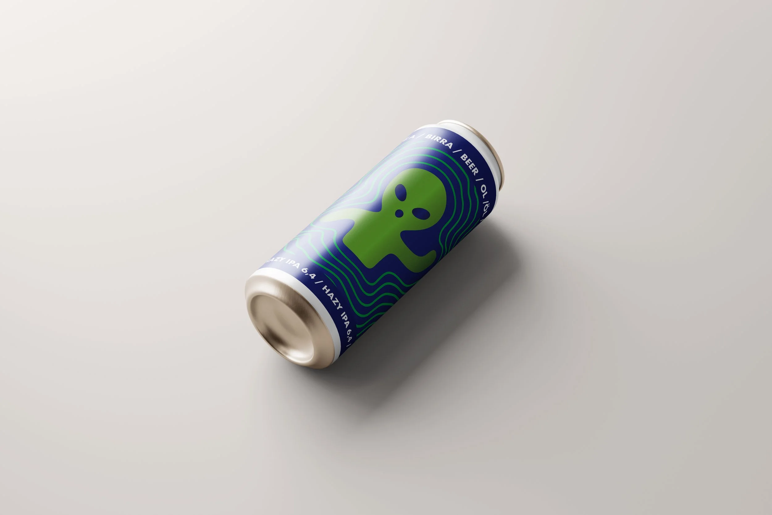

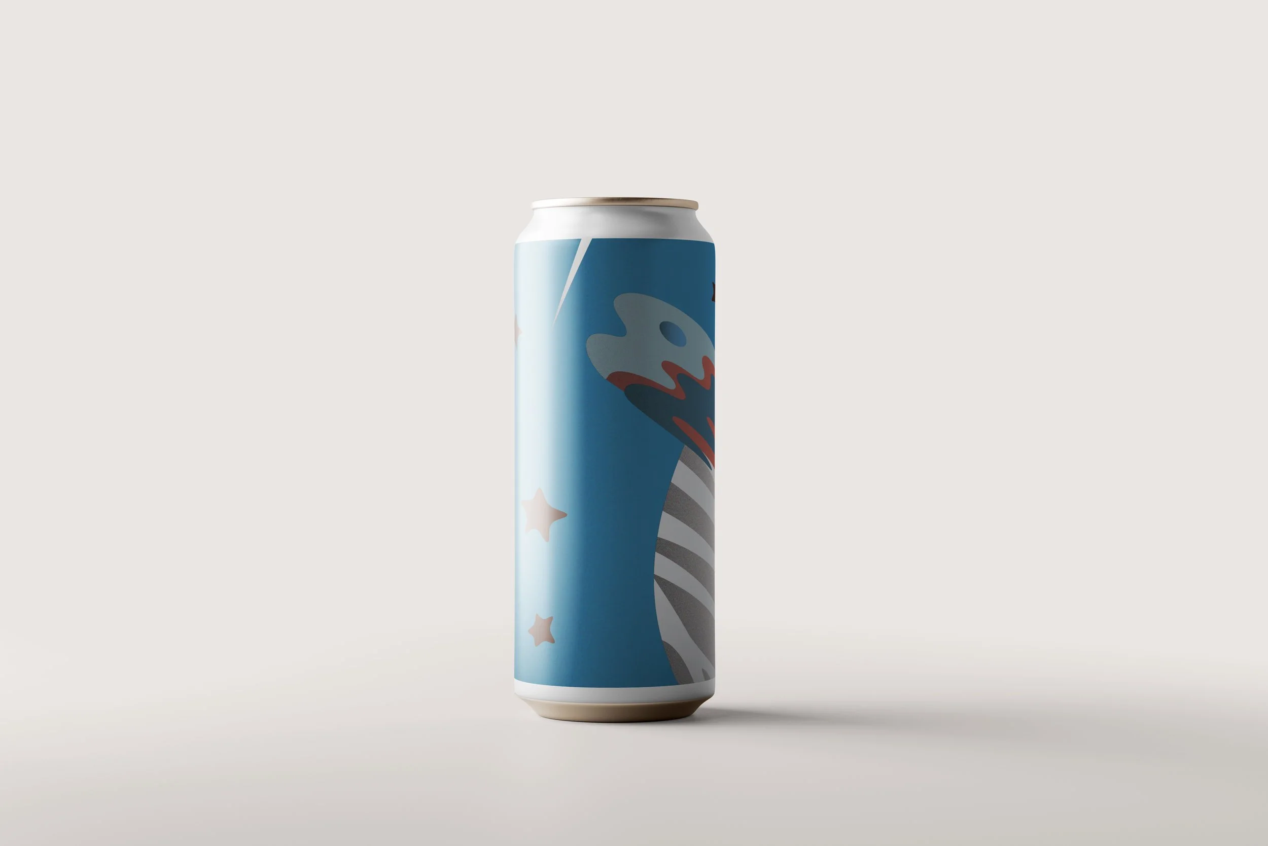
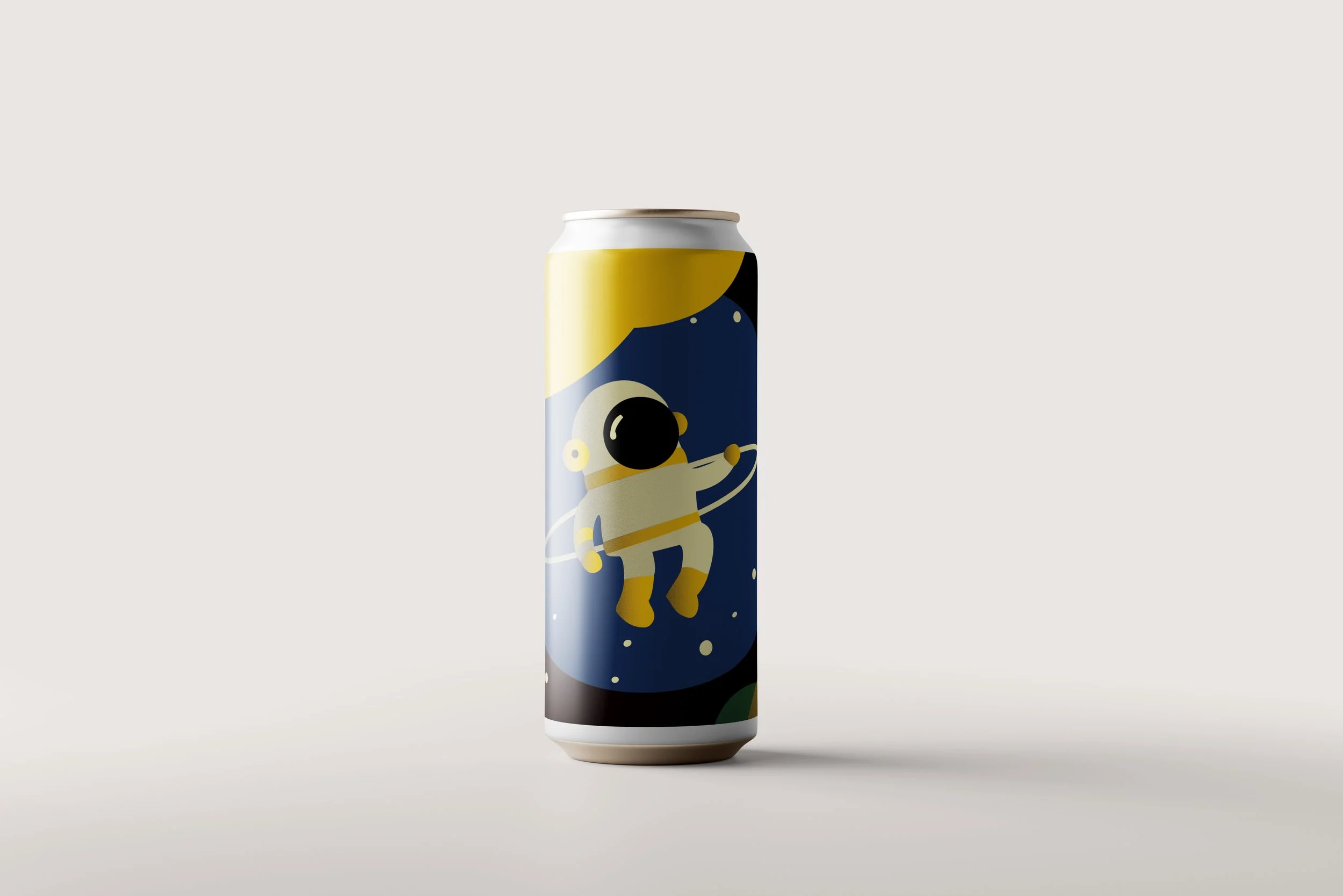
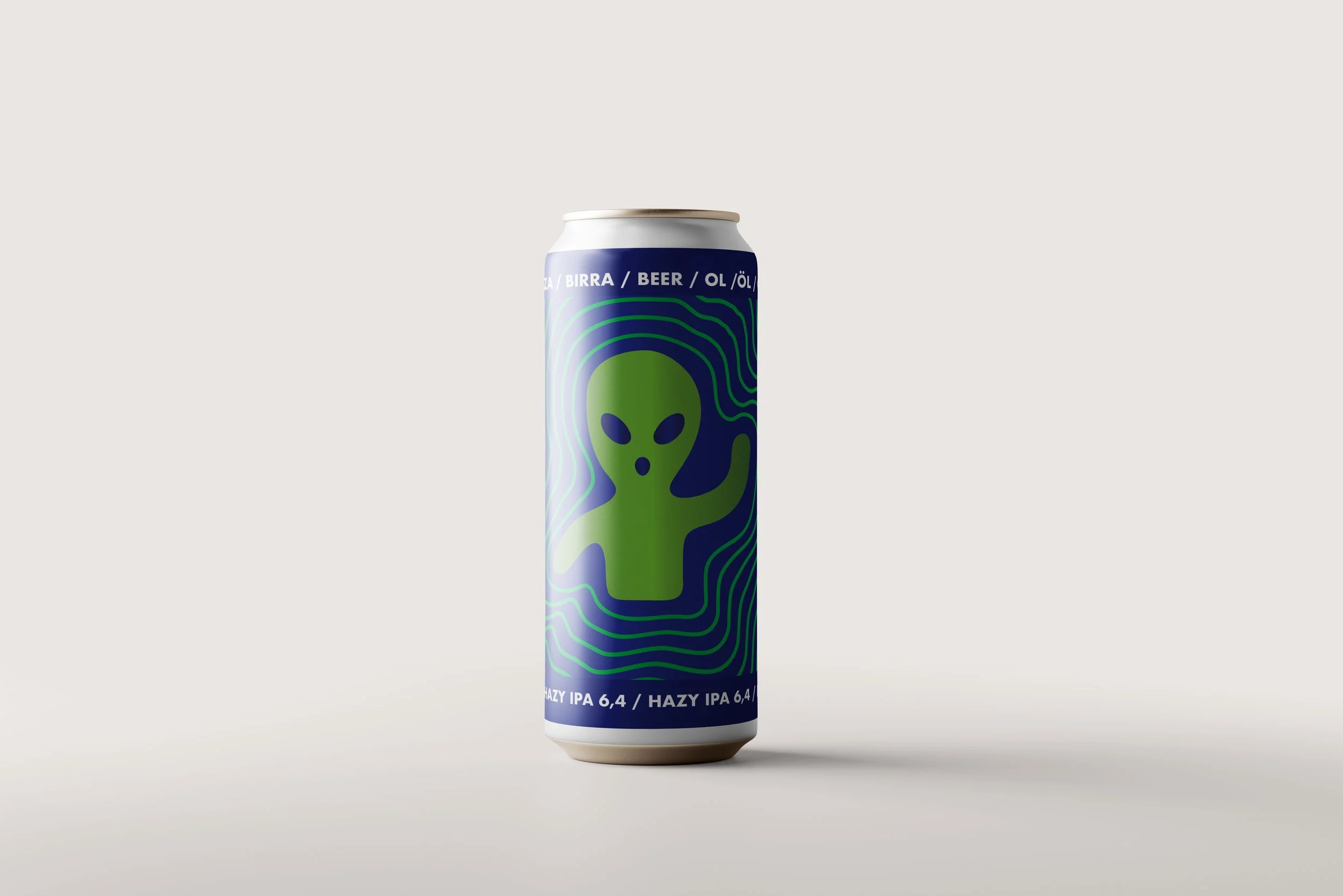
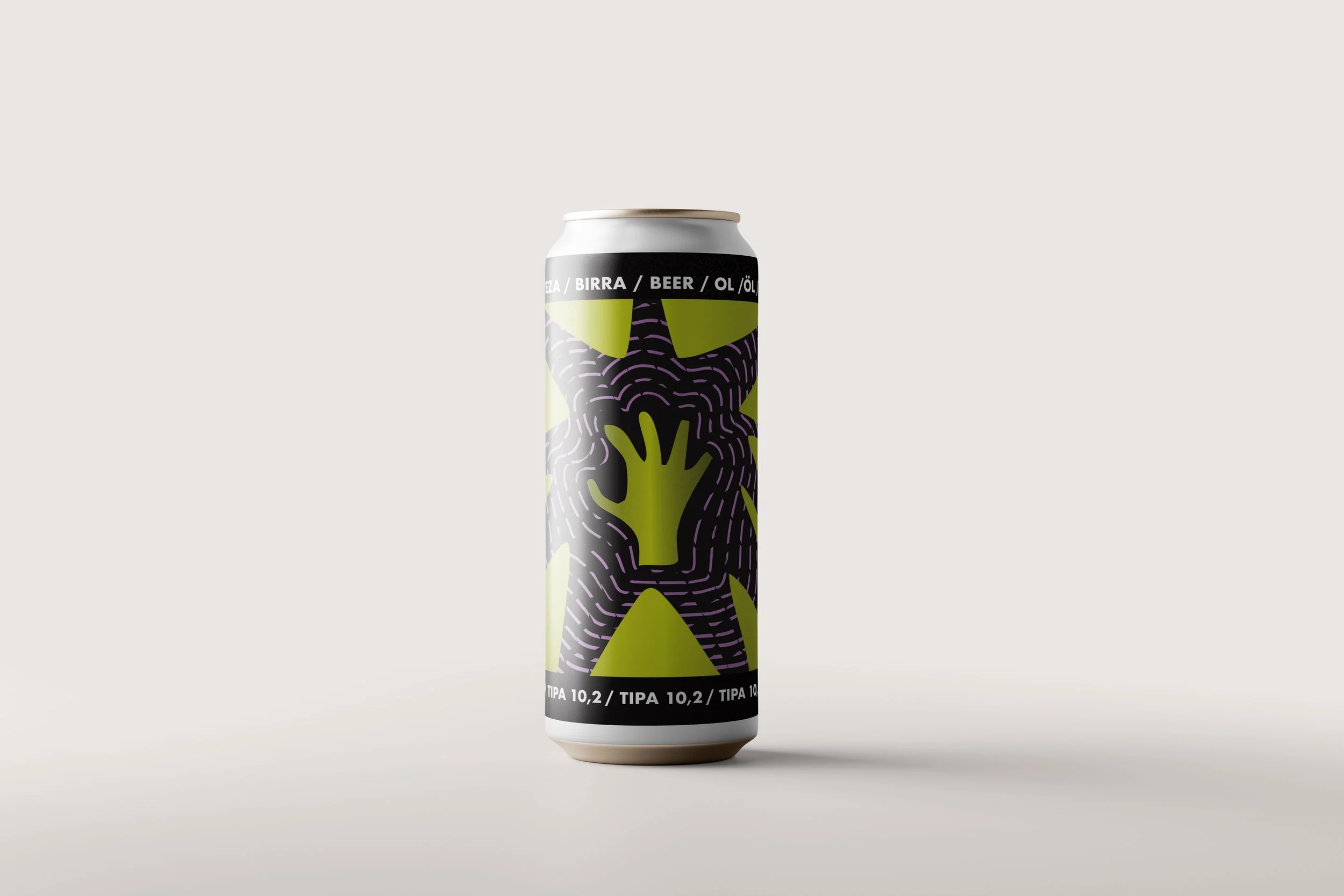
To develop the first cohesive visual system for the three IPA varieties, I took inspiration from alien iconography — including extraterrestrial figures, an all-seeing eye, and green hands emitting vibrational waves. The concept was based on the idea that these beings exist and can be perceived through the frequencies they emit. This narrative informed a bold and distinctive graphic language that captured the intensity and uniqueness of each beer, while reinforcing the brand’s unconventional and exploratory spirit.


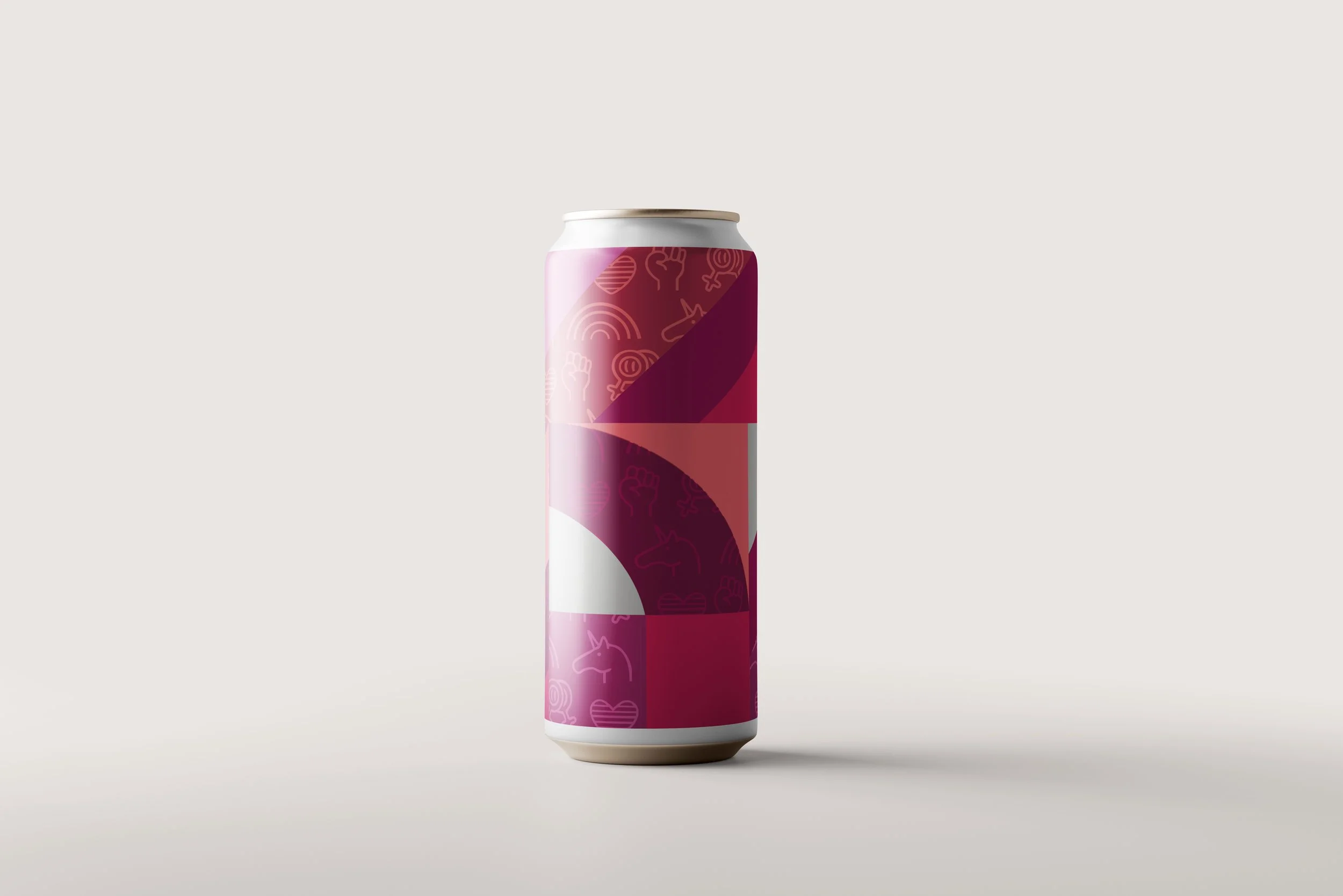
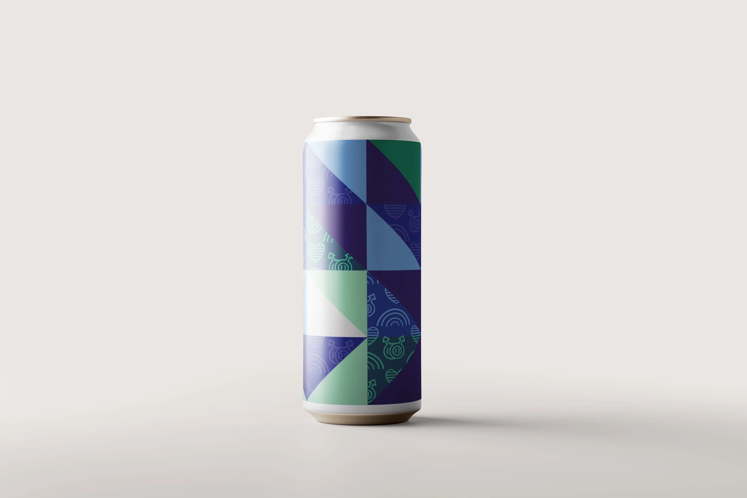
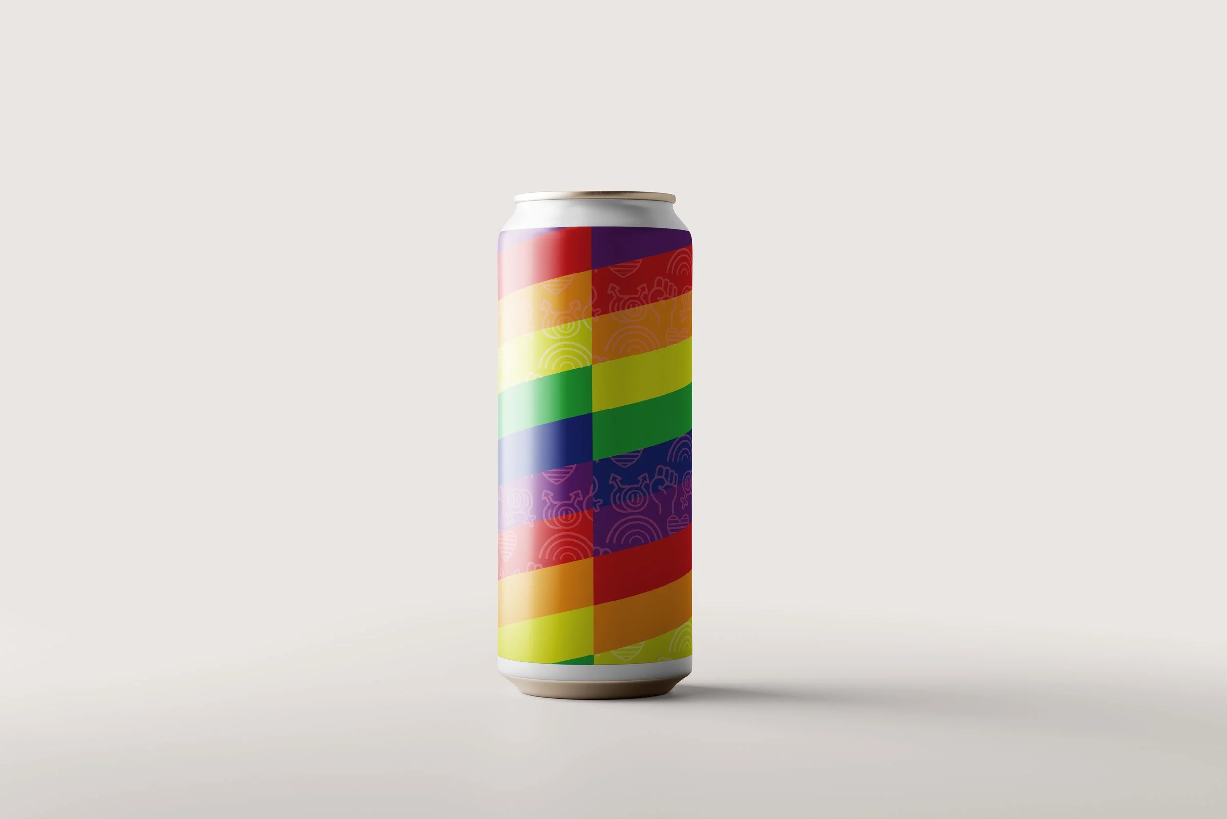
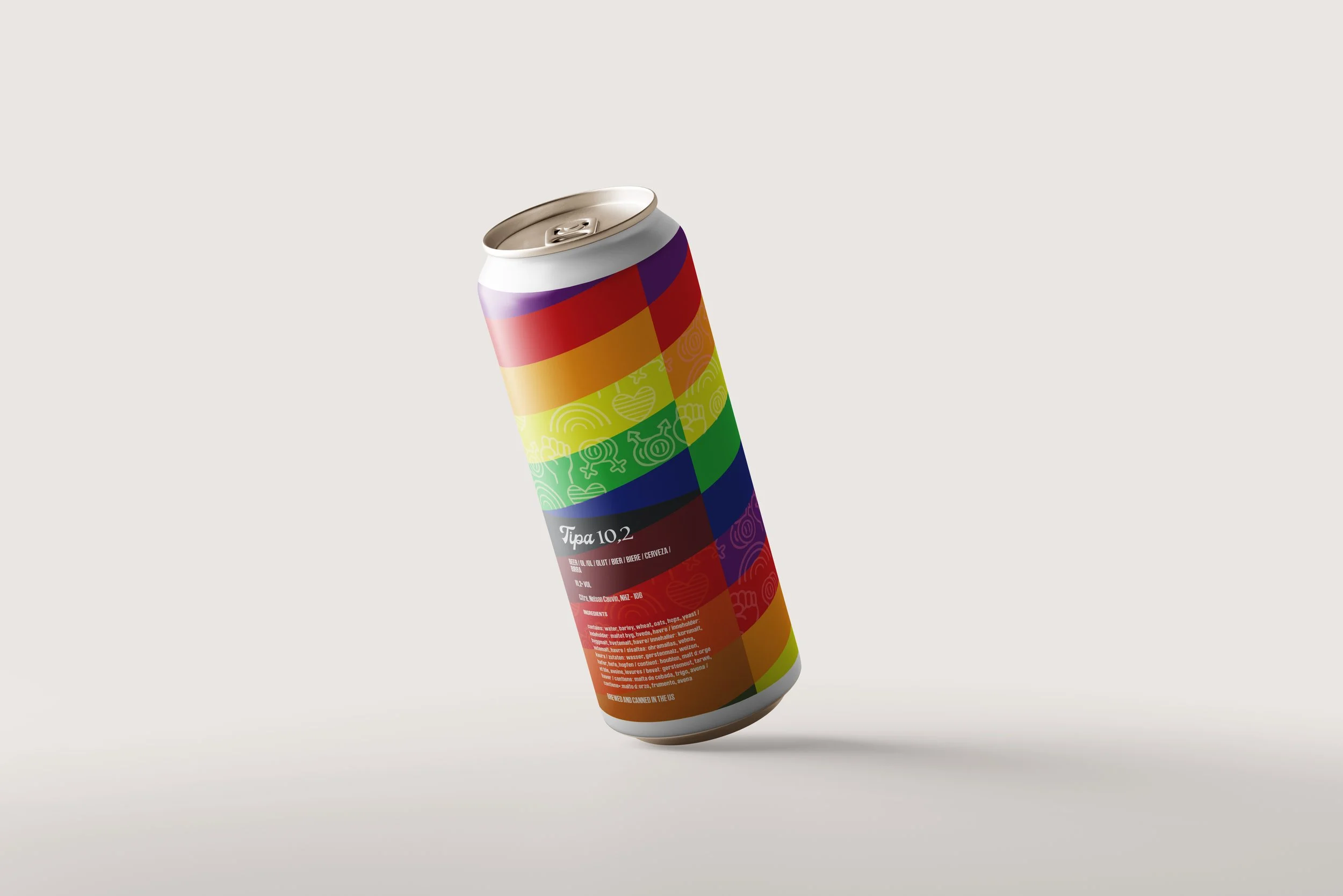
For the second graphic line developed for the IPA series, I drew inspiration from the colors of LGBTQ+ community flags, emphasizing their symbolic meaning and the values they represent. Through a refined visual language and inclusive iconography, the design aimed to communicate a clear message of pride, solidarity, and respect. This approach not only celebrated diversity, but also aligned with the brand’s commitment to representation and cultural relevance.


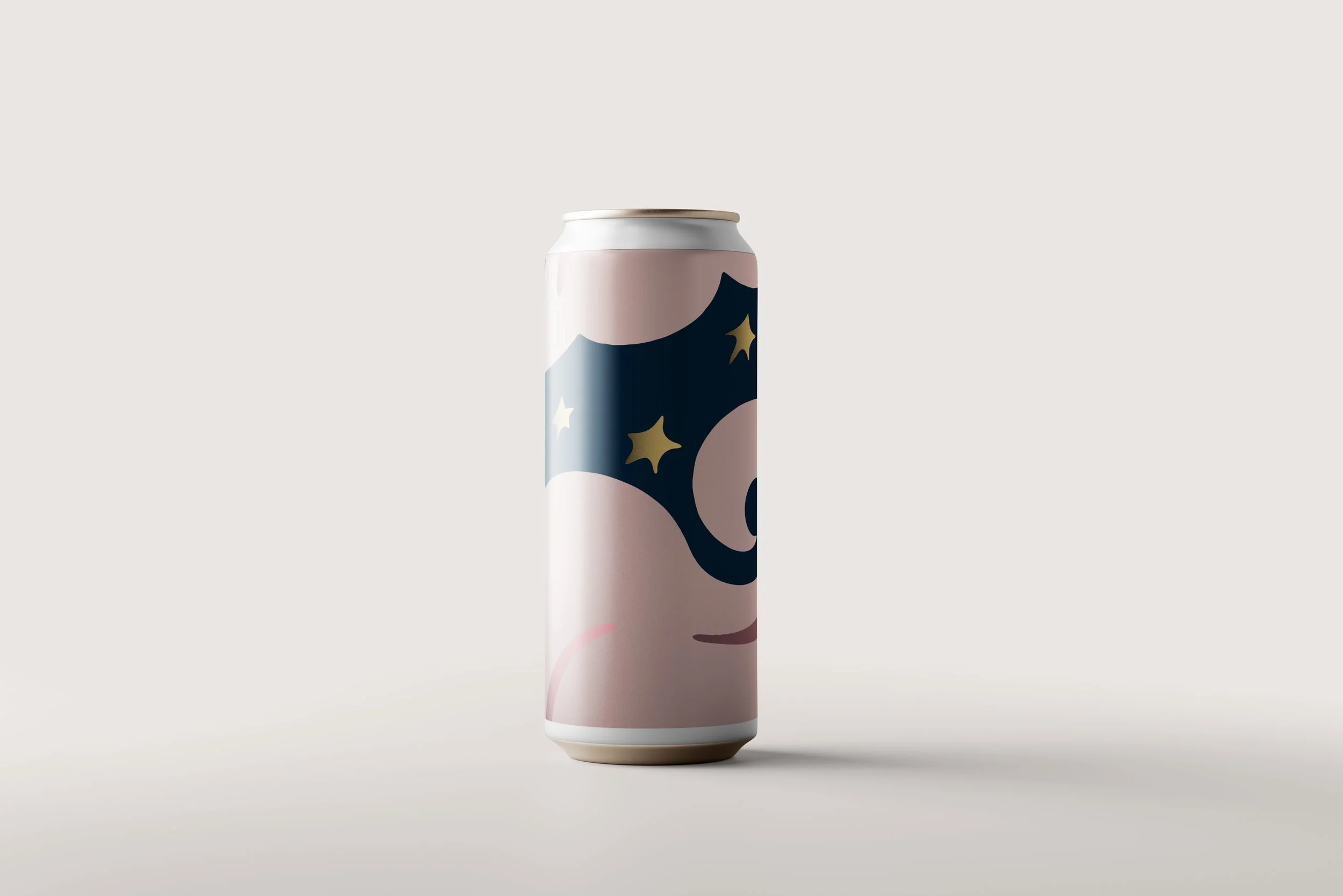
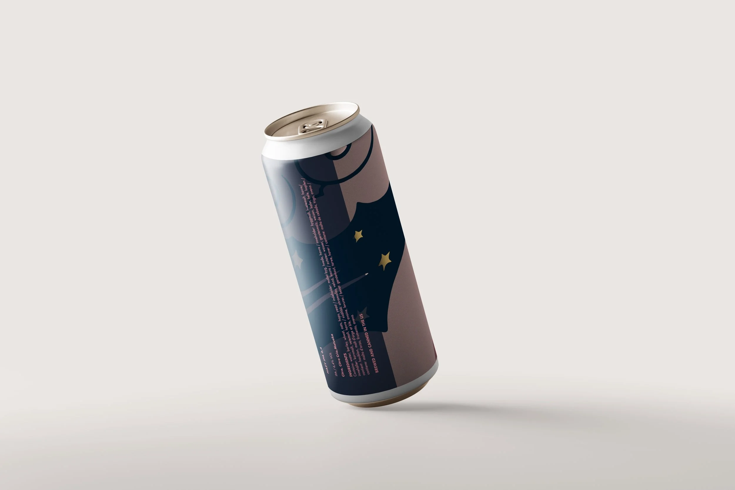
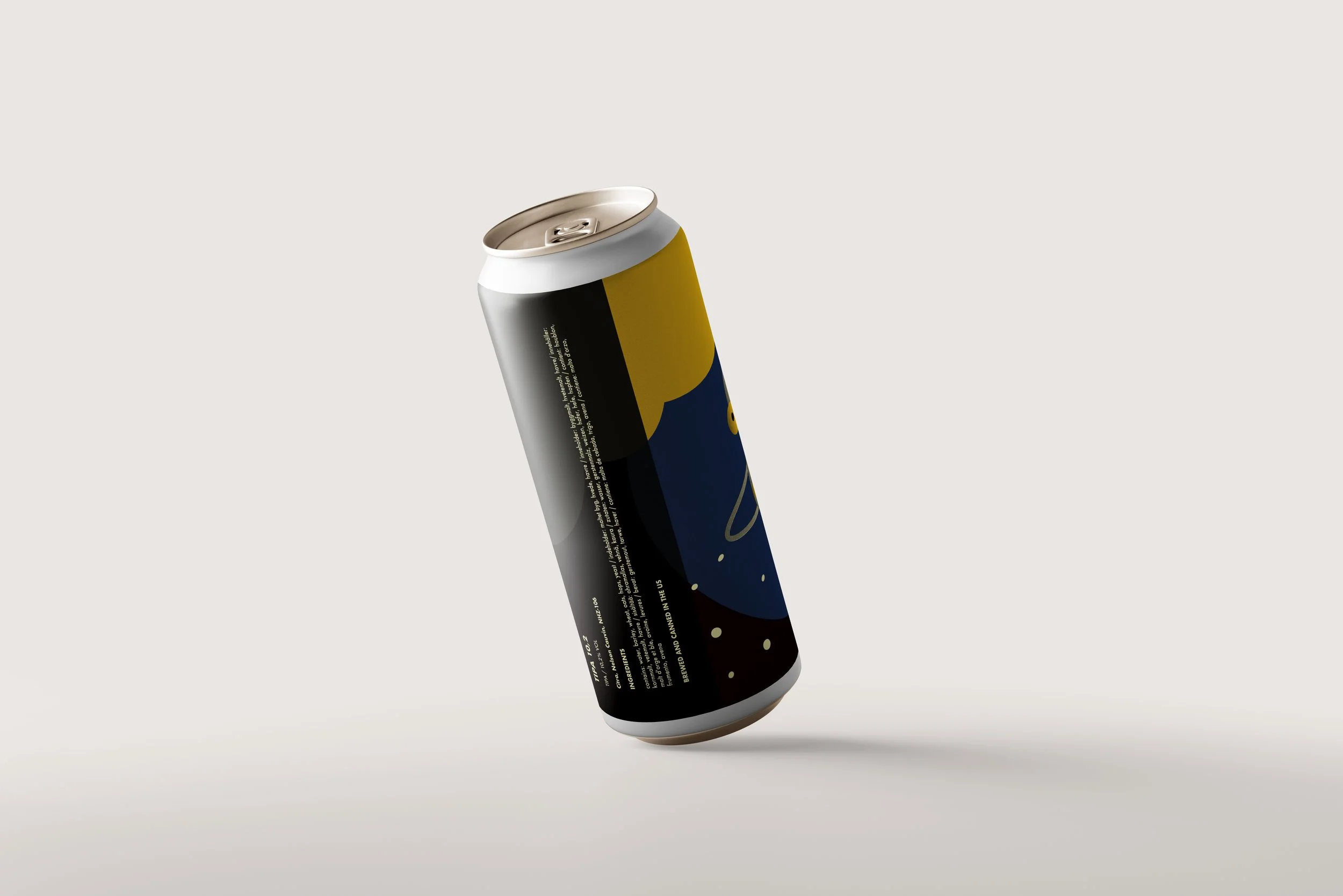
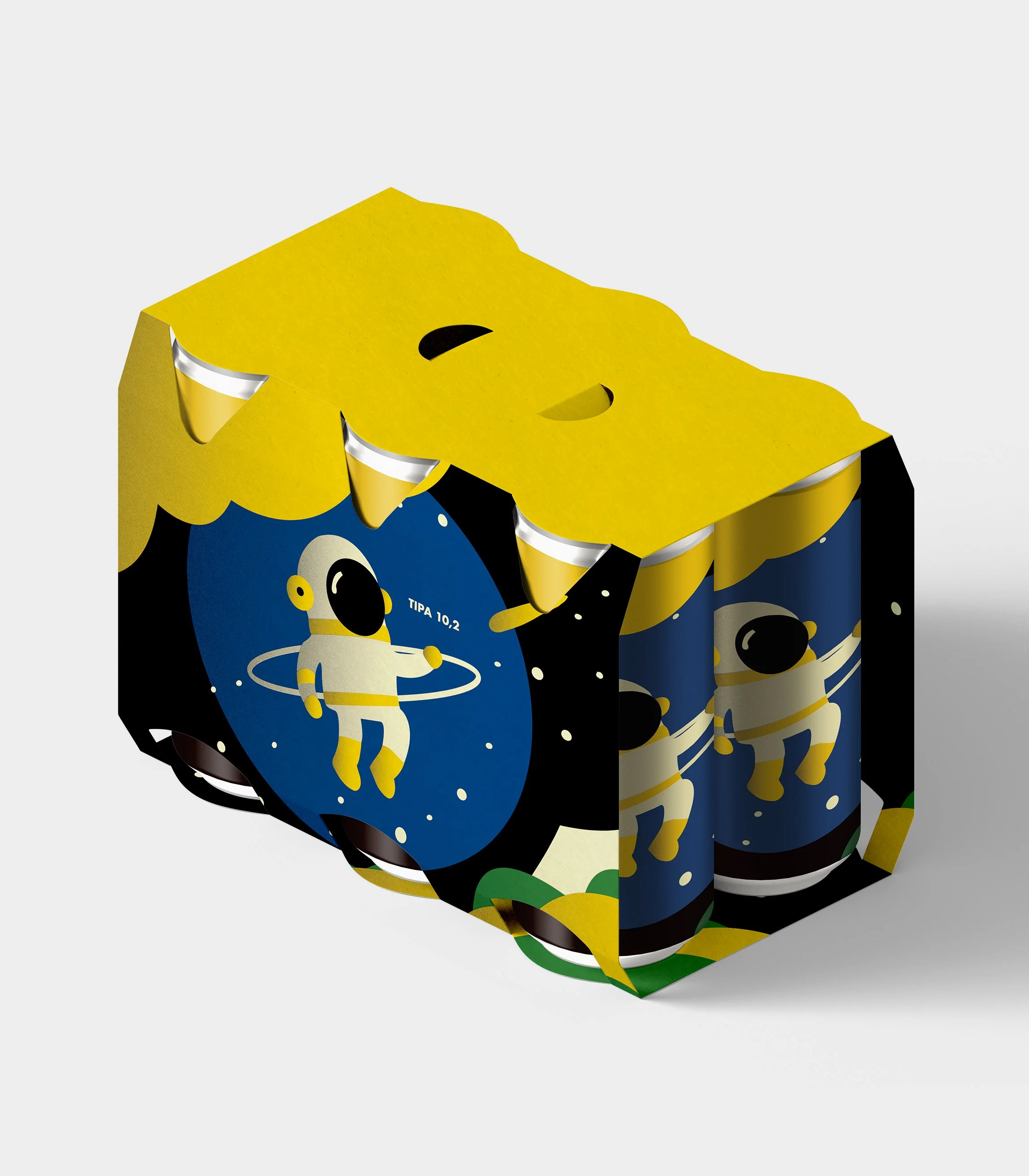
For the third graphic line encompassing all three IPA varieties, I drew inspiration from the universe — its galaxies, phases, and captivating color palettes. Each design was thoughtfully developed to reflect the unique intensity and character of each beer, using cosmic elements to evoke a sense of depth, mystery, and exploration. This visual approach added a conceptual layer that connected the product to a larger, imaginative narrative.