
Atypicall
Atypicall is the final project developed for my Master’s in Branding and Visual Communication at Istituto Europeo di Design (IED) in Madrid, Spain.
It is a conceptual clothing brand designed as a response to the discomfort many individuals experience in social spaces where they feel they don’t fully belong. Rooted in the cultural context of Madrid, the project was developed entirely in Spanish to preserve its local and emotional relevance.
The brand explores vulnerability as a form of strength, using symbolic design, poetic language, and community-driven experiences to foster genuine human connection. More than a fashion label, Atypicall positions itself as a platform for self-expression, emotional resonance, and collective reflection.

We don’t all move through the world the same way. Some people seek corners, sit on the floor, or follow a quieter rhythm — simply trying to breathe a little easier in a system that wasn’t built for them.
Atypicall was created for them. For those who feel too much, think differently, and don’t fit into the box.
For the ones who write, pause, cry, rebuild, and embrace life with all its cracks.
This project is for those who don’t need fixing — just space to be.
Why I Created This Project
*
Why I Created This Project *
Color Palette – White Heat & Warm Red
Atypicall uses two primary colors to express its emotional tone. White Heat serves as a calm, open background — a space for pause and reflection. Warm Red adds emotional depth and presence, used in symbols and key elements to convey warmth, care, and honesty. Together, they create a balance between softness and bold expression, echoing the brand’s core values.


Symbols & Typography
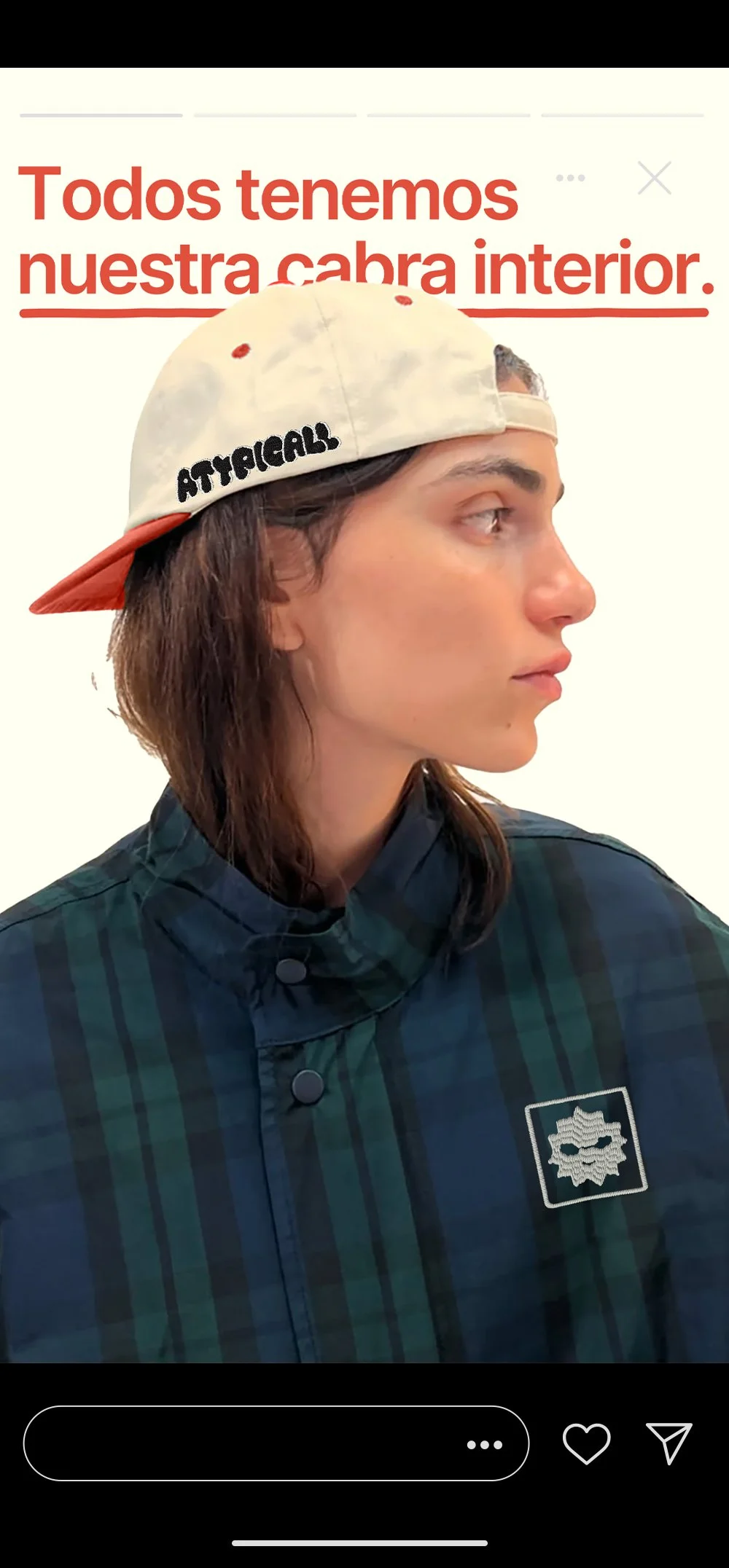
I designed a set of hand-drawn, irregular symbols as a visual language for emotions that are hard to put into words — representing ideas like vulnerability, connection, and inner strength.
To complement this system, I chose Inter as the main typeface for its clarity, warmth, and versatility across both digital and physical spaces. Its simplicity balances the expressiveness of the symbols, reinforcing the brand’s emotional voice.
The Logo
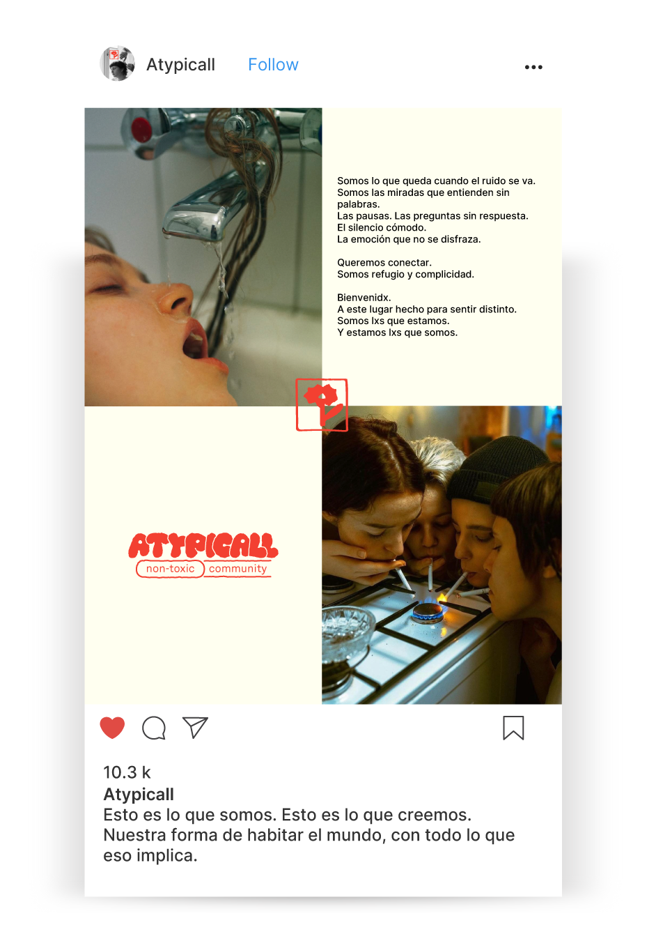
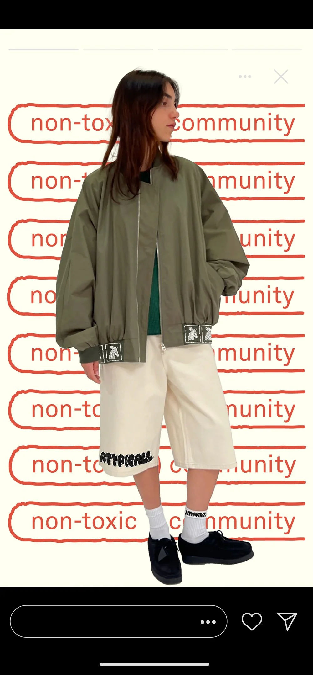
The Atypicall logo is a custom wordmark designed with subtle imperfections, reflecting the brand’s embrace of vulnerability, individuality, and quiet resistance to social norms. Paired with the claim “non-toxic community,” the logo becomes more than a visual mark — it acts as a statement of intent. Together, the design and message create a calm, honest space that invites emotional safety, self-expression, and a sense of belonging for those who often feel out of place.

Welcome to Atypicall — a space built for those who feel too much, too different, or simply out of place.
Our street strategy isn’t about selling a product — it’s about creating connection. We use bold, emotional phrases designed to make people pause, reflect, and feel seen. If something resonates, they’ll know where to find us. That moment of recognition is what opens the door.
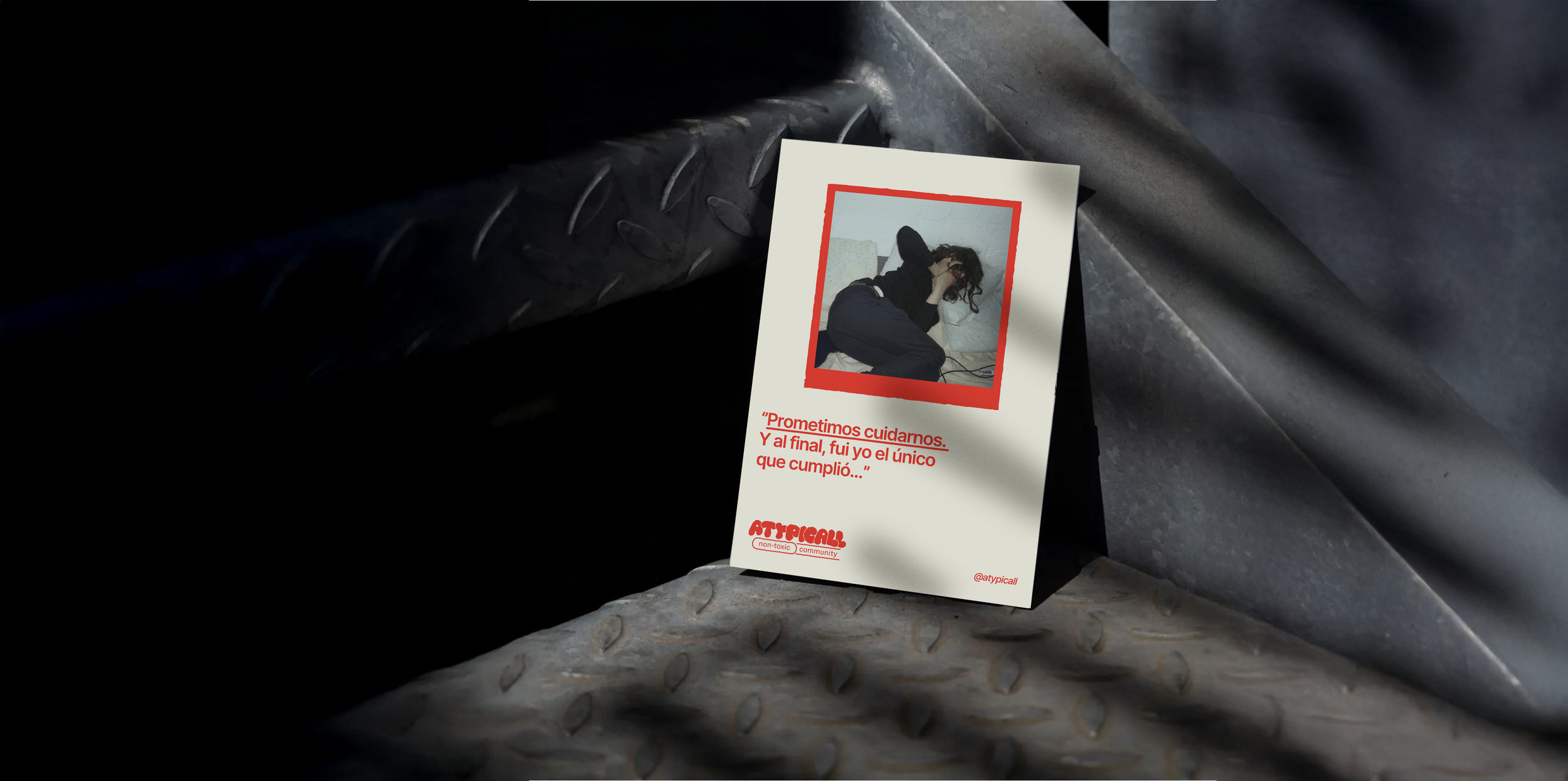
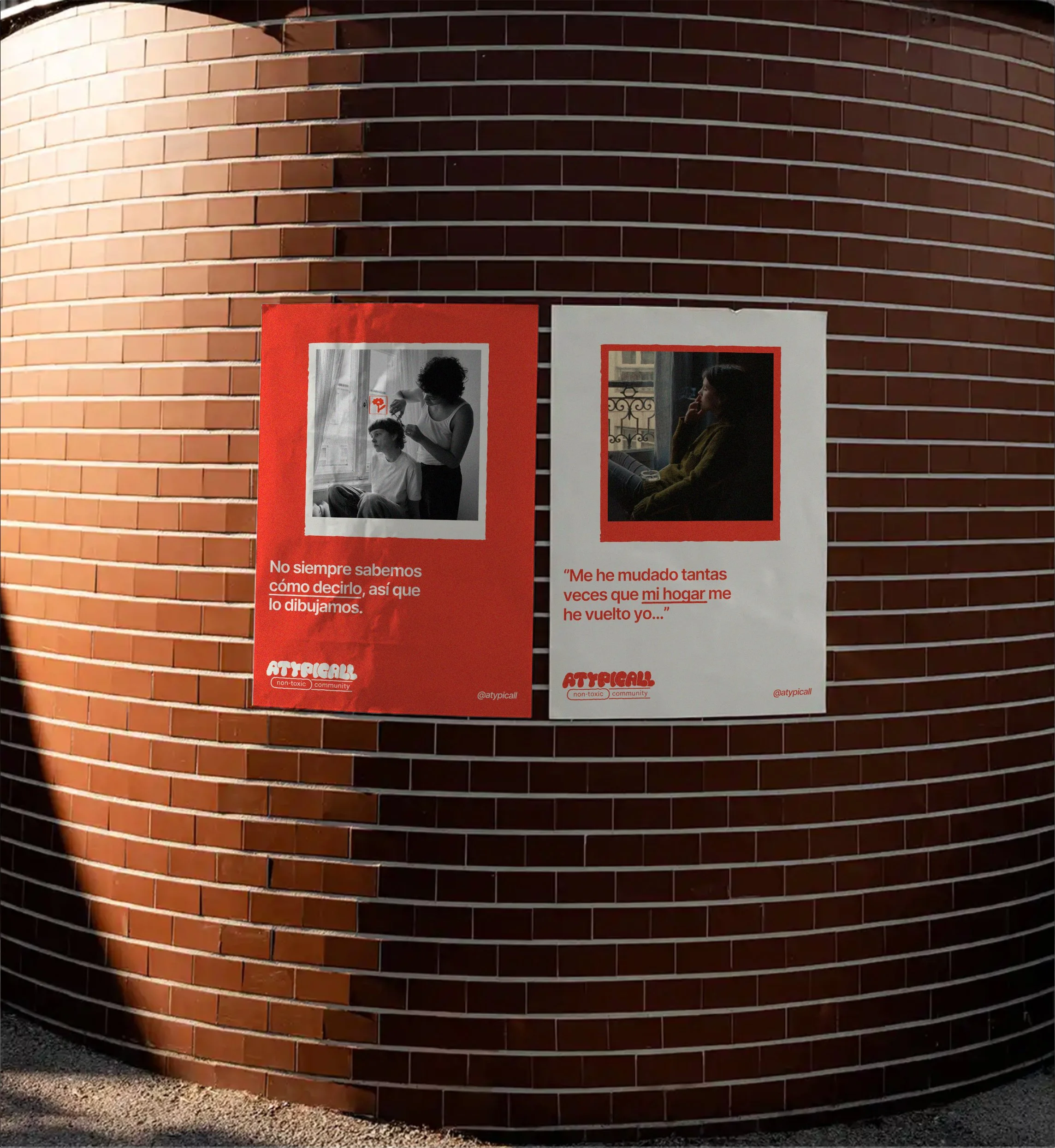
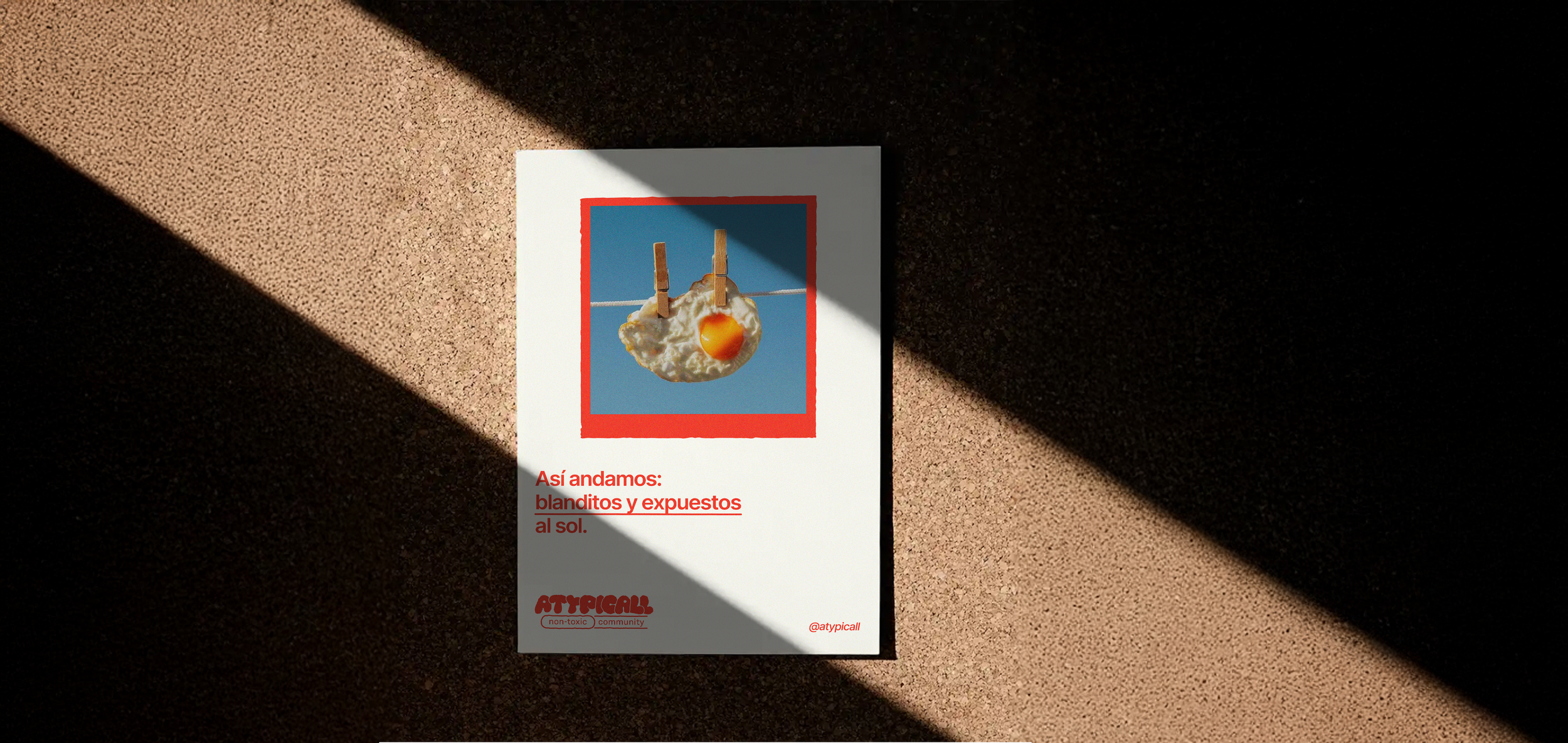
Street Posters
*
Street Posters *
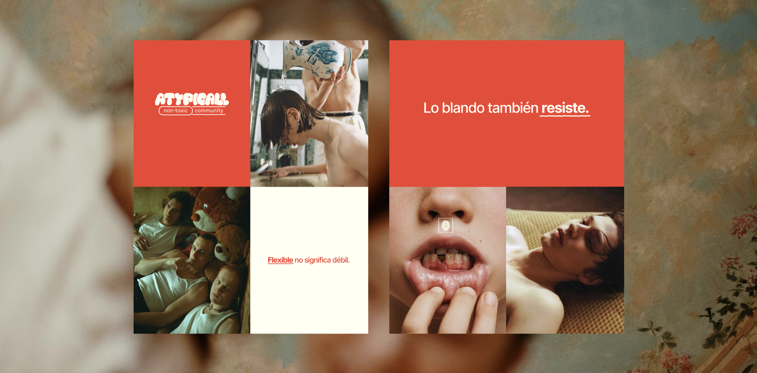
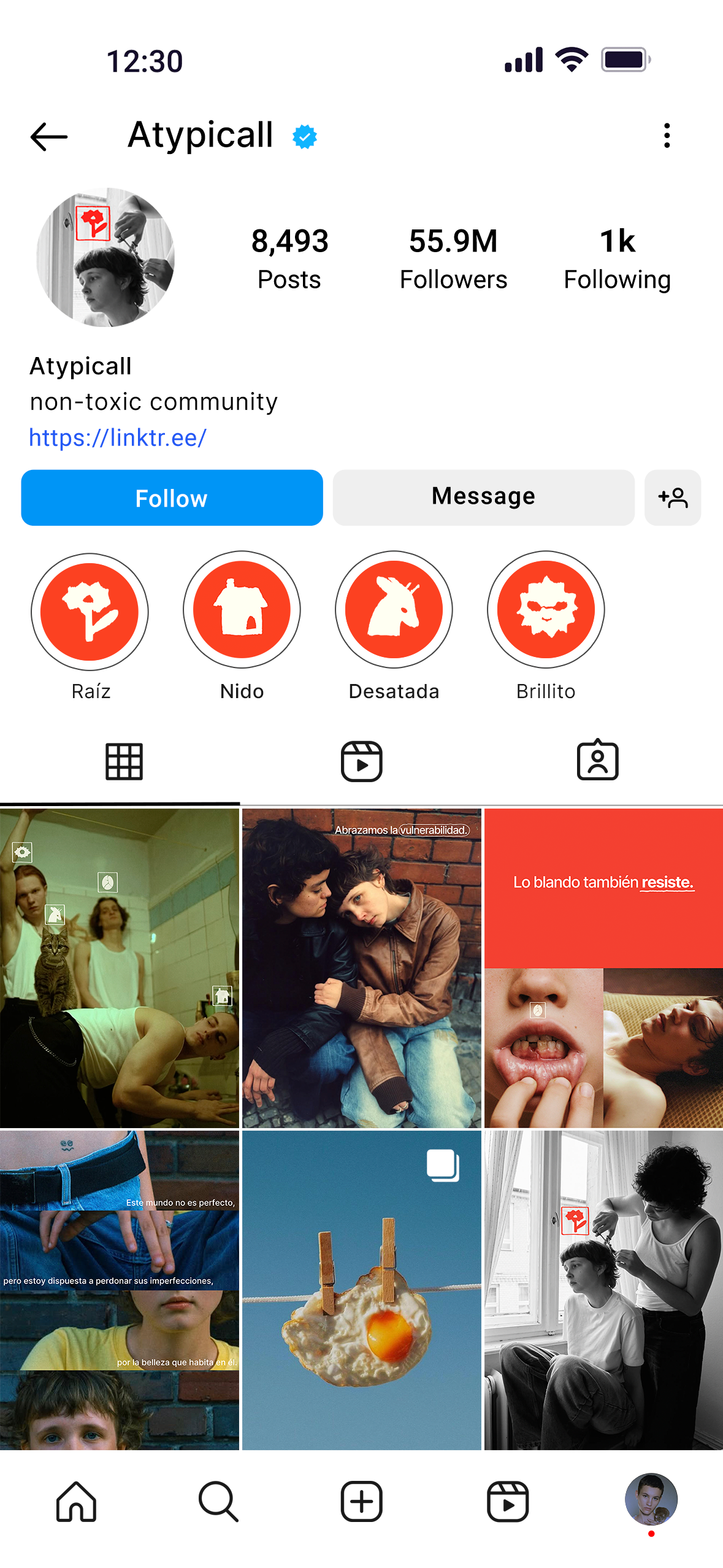
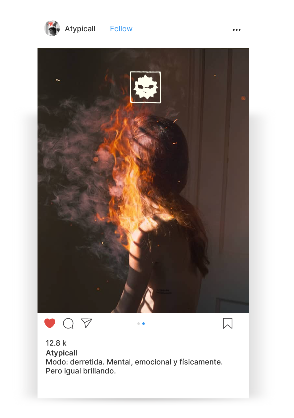
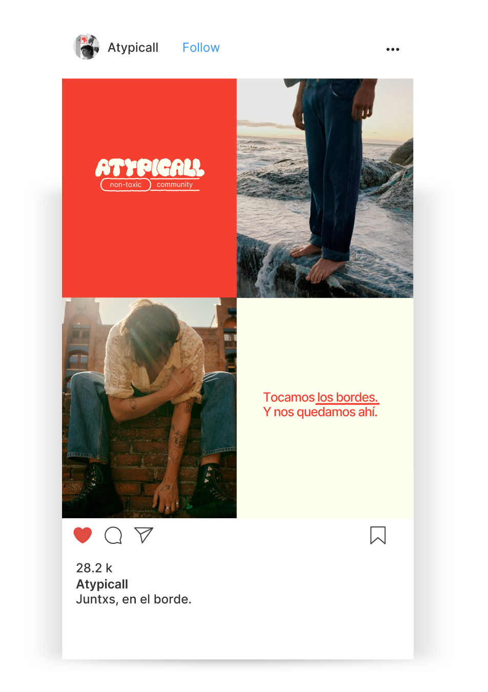
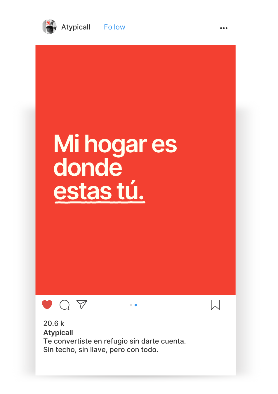
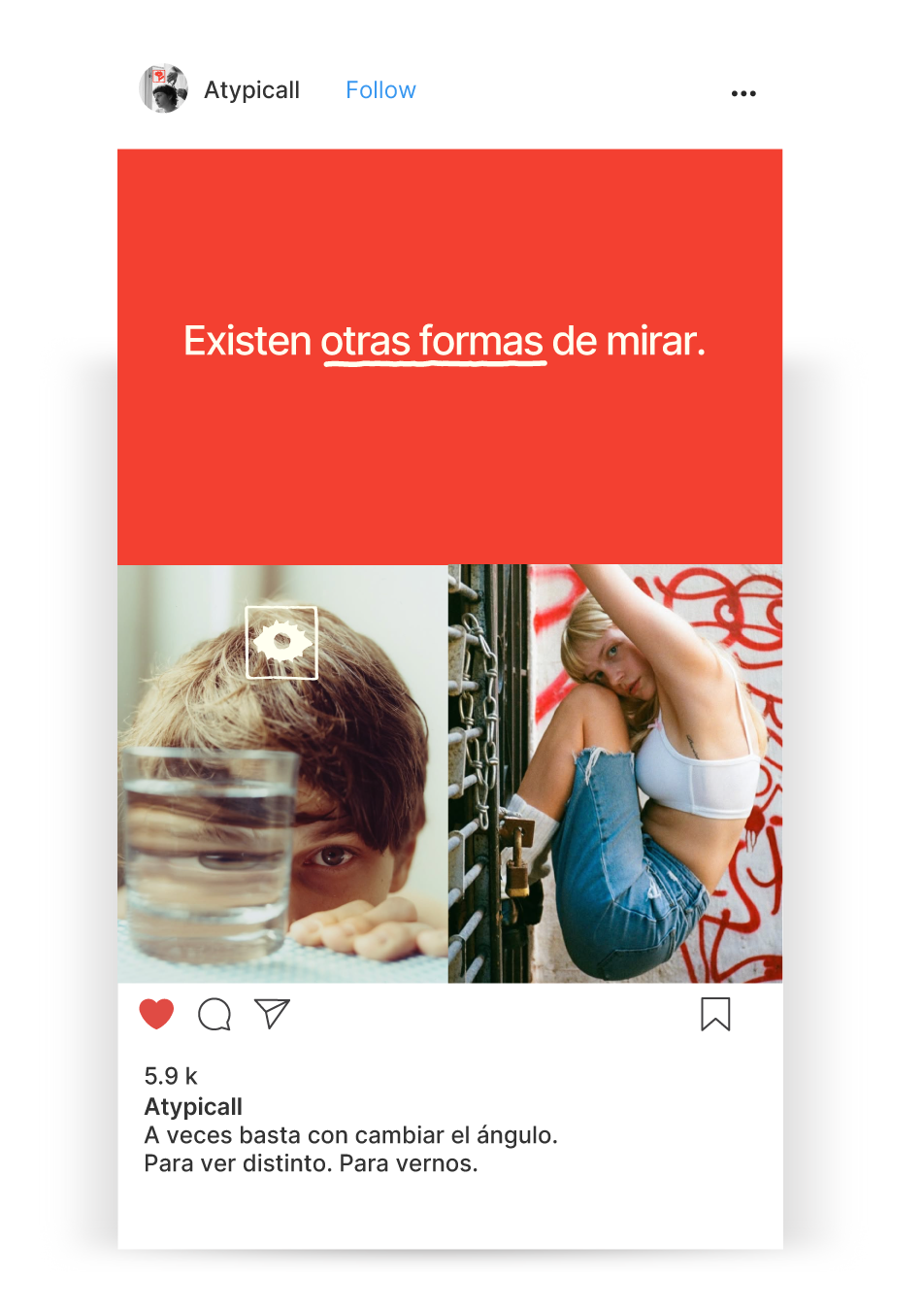
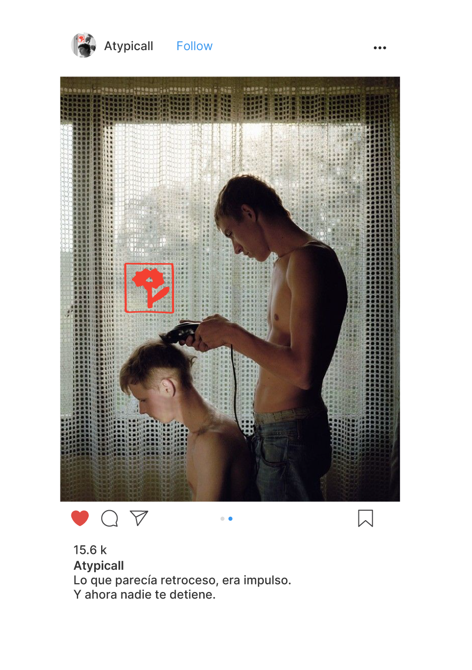
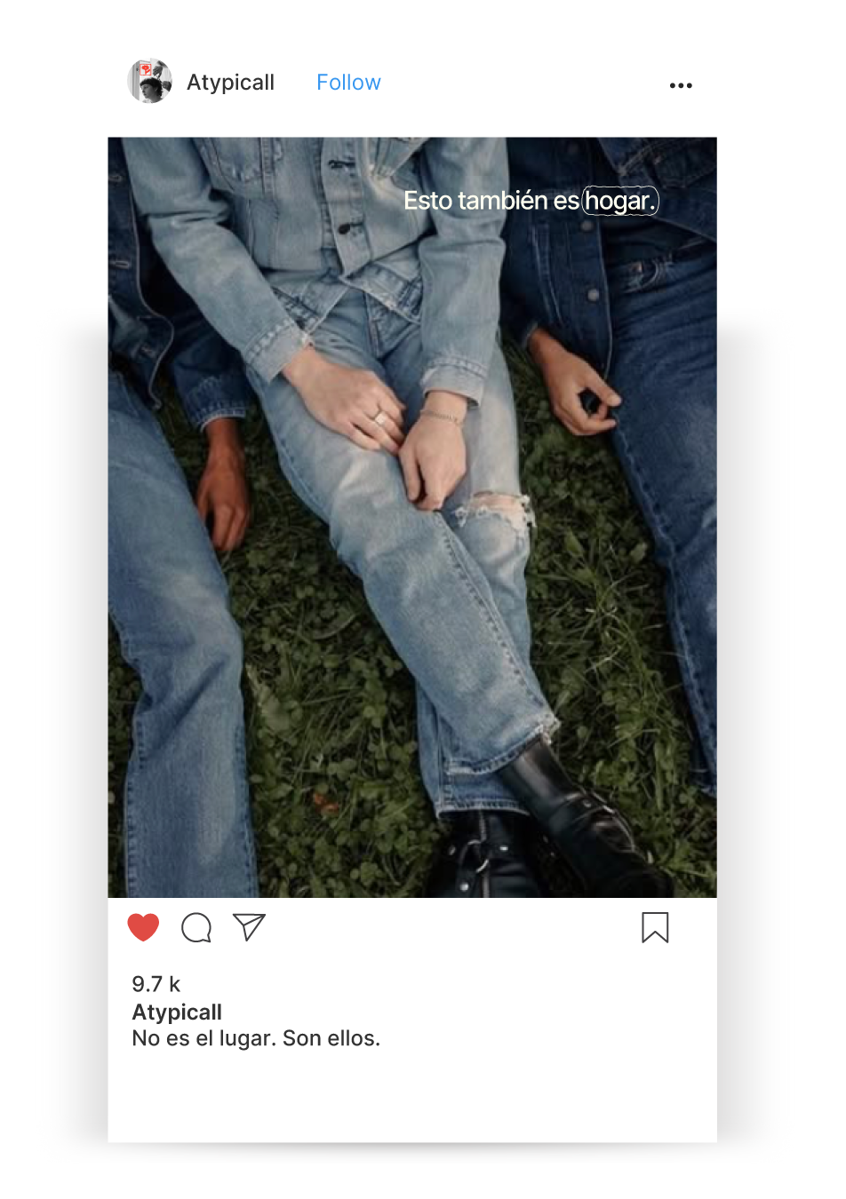
The main account serves as a space for emotional and collective expression. Through a consistent visual language —short phrases, intimate photography, and original symbols— we create content that invites connection and community-building beyond the product itself.
Instagram – @atypicall
*
Instagram – @atypicall *
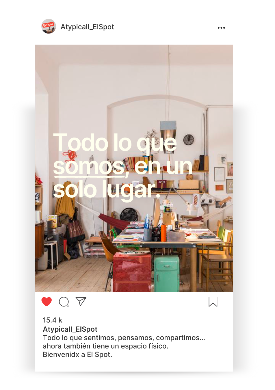
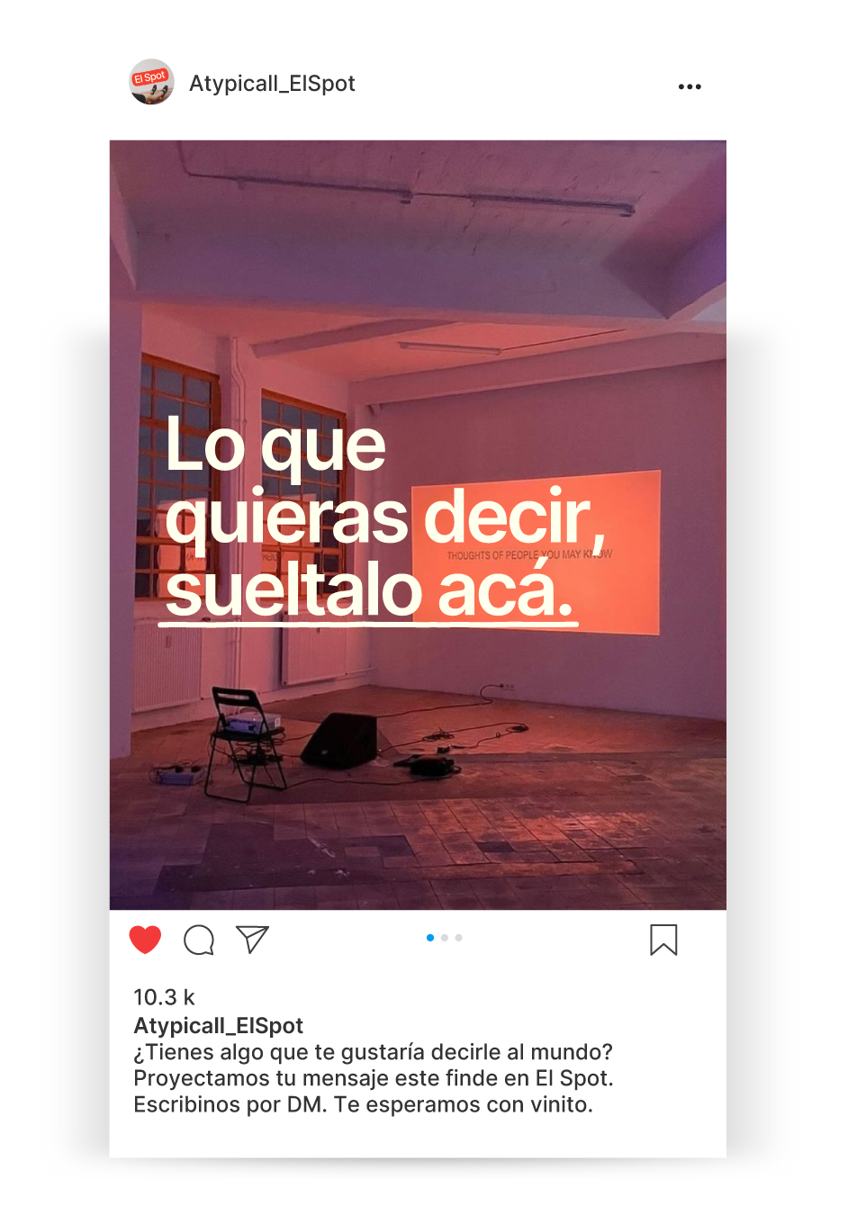
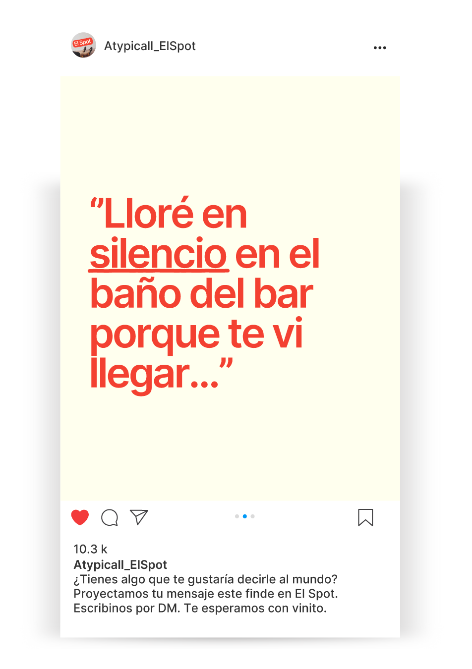
El Spot is not just a store — it’s a space to play, to talk to strangers, and to leave with a new connection.
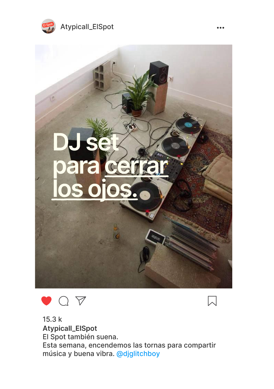
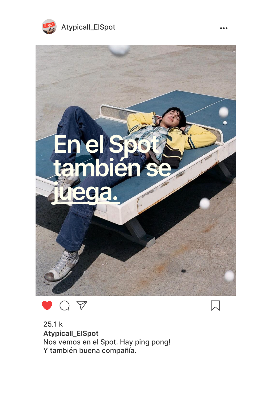
Things happen here: weekend DJ sets, spontaneous ping pong games between people who just met, shared wine, and of course, merch made with emotion.
On Instagram, we showcase the life inside — the energy of the space, the activities that bring us together, the objects that carry our symbols, and above all, the experience of belonging.
We’re not asking you to come build community.
We’re simply opening the door to one that already exists — and moves with you.
El Spot – @atypicall_elspot
*
El Spot – @atypicall_elspot *


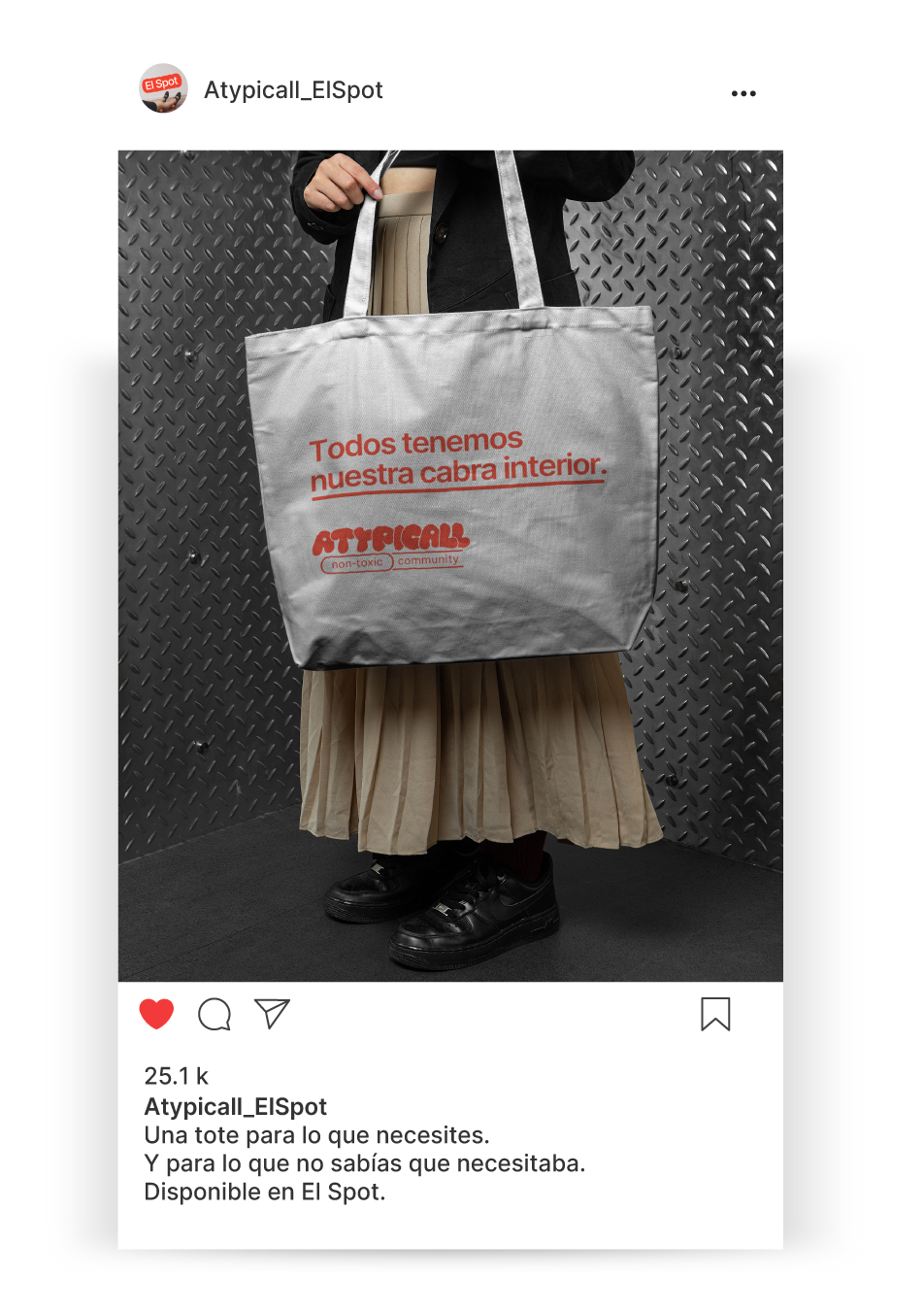
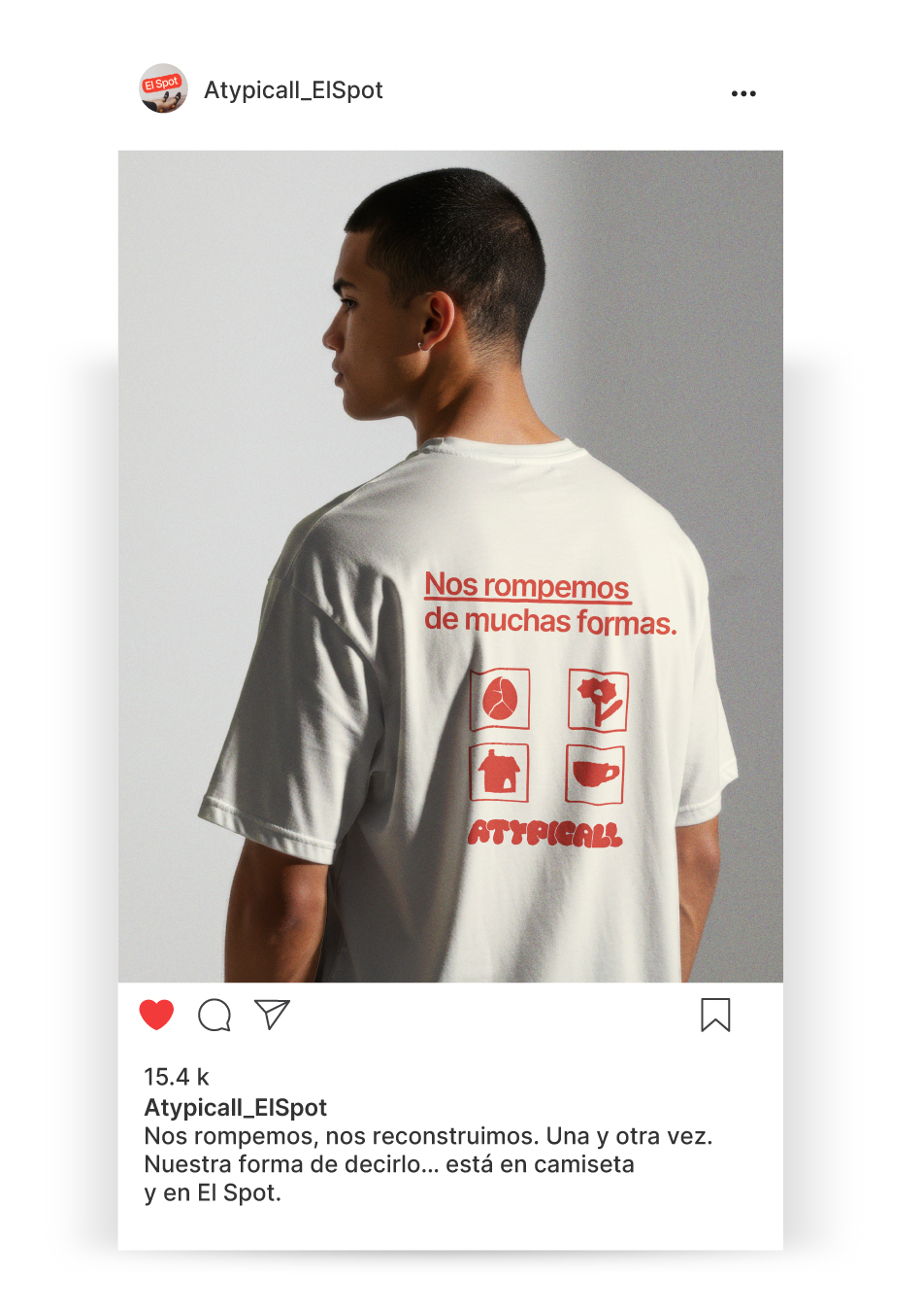
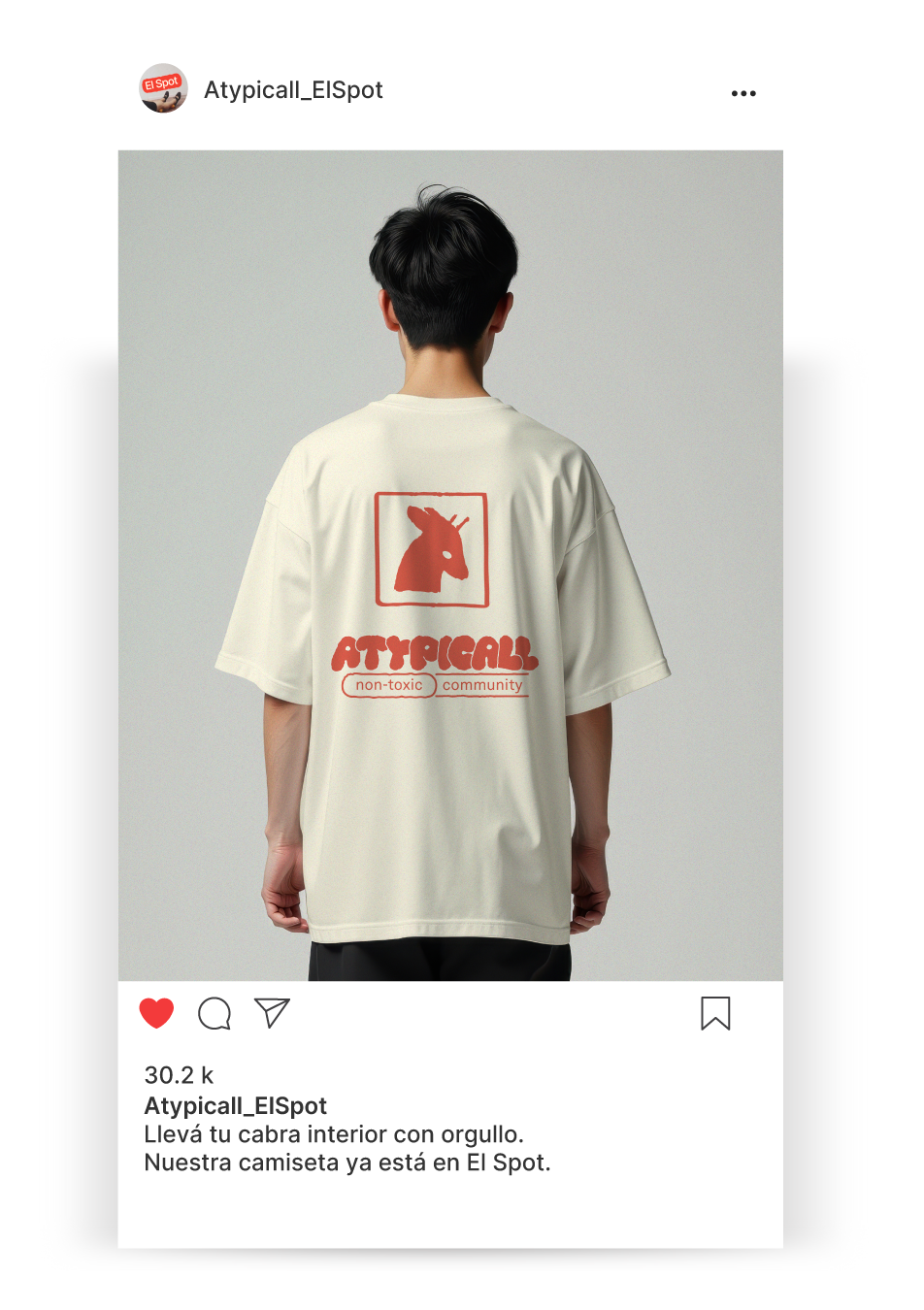
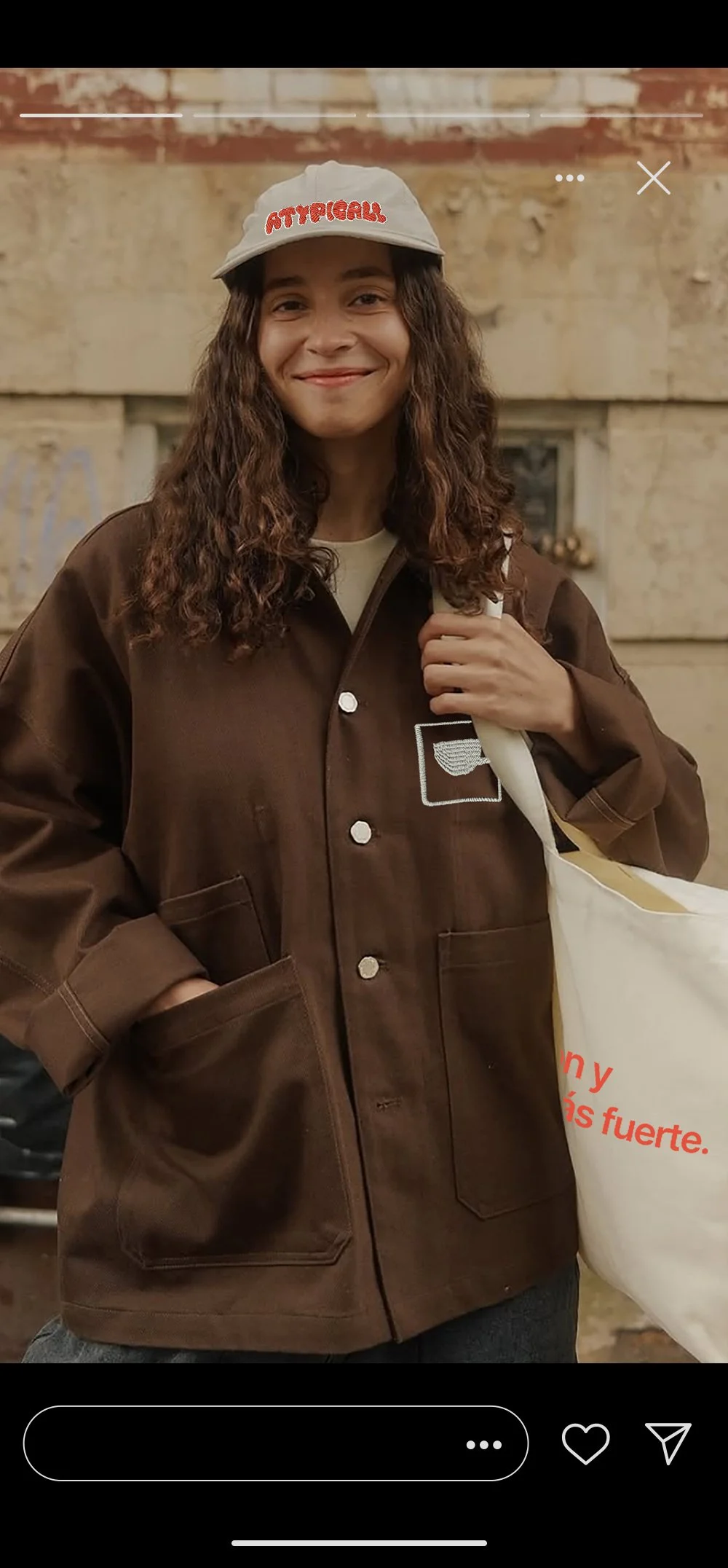
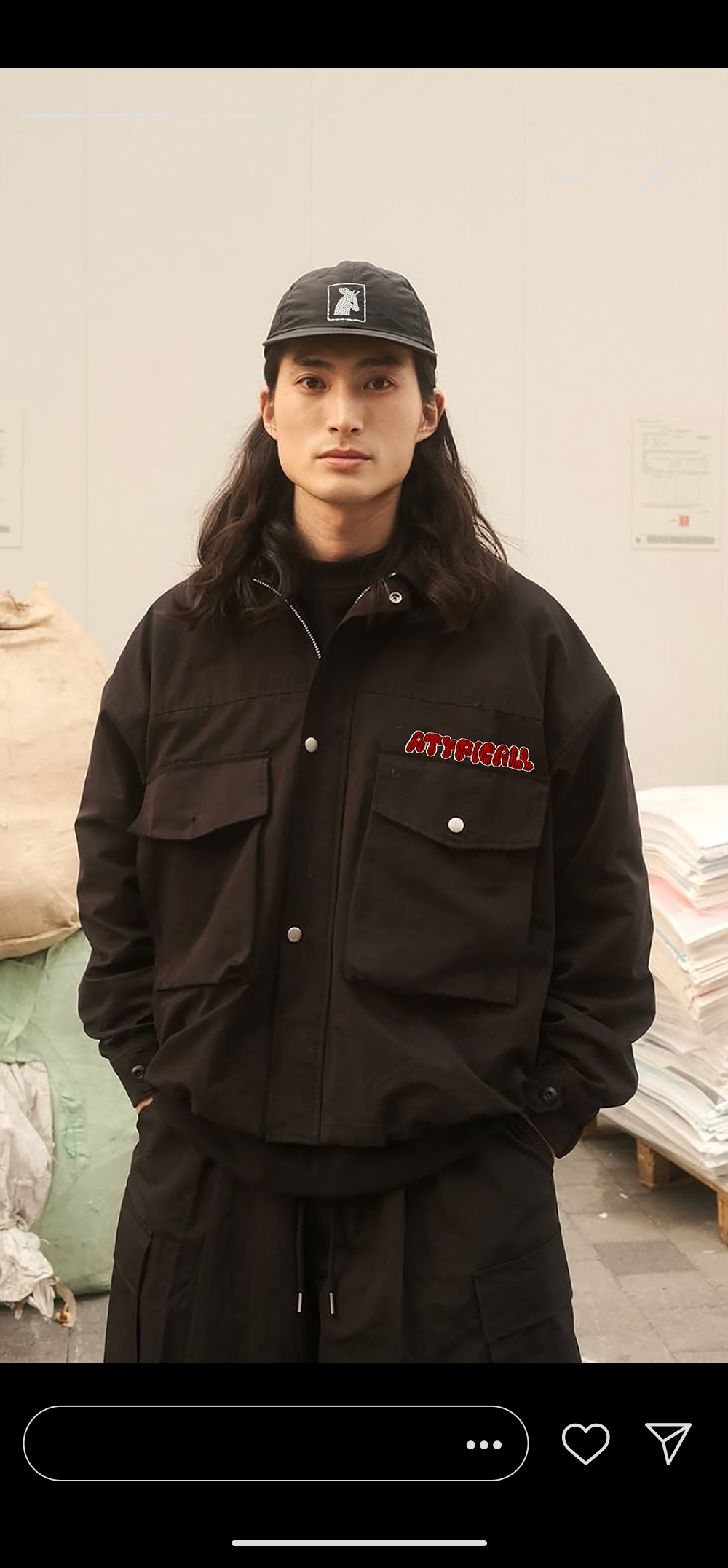
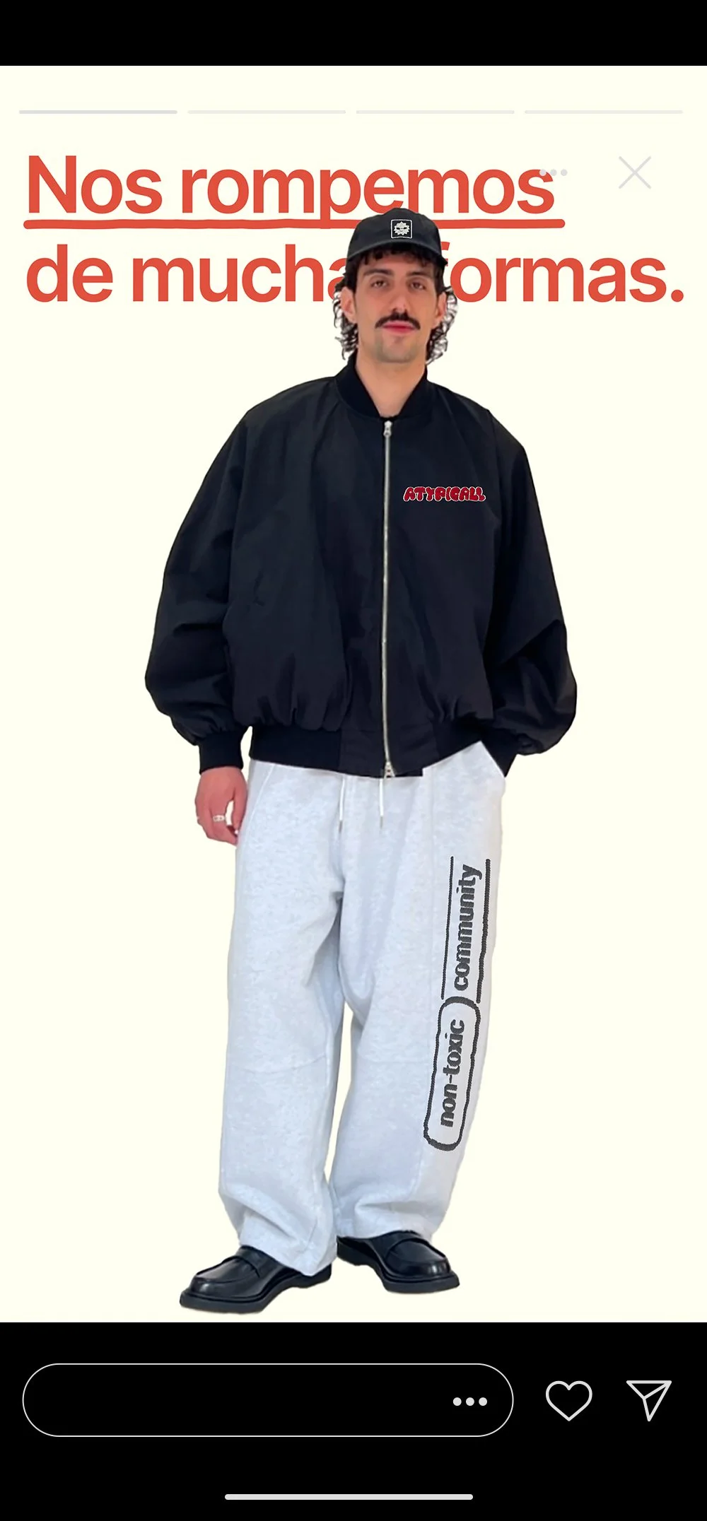
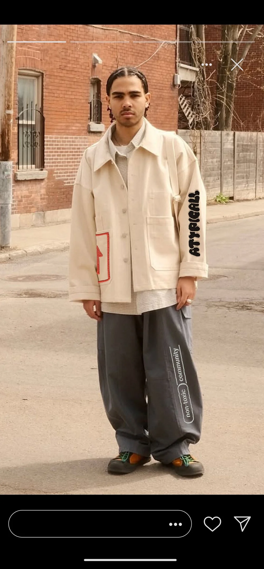
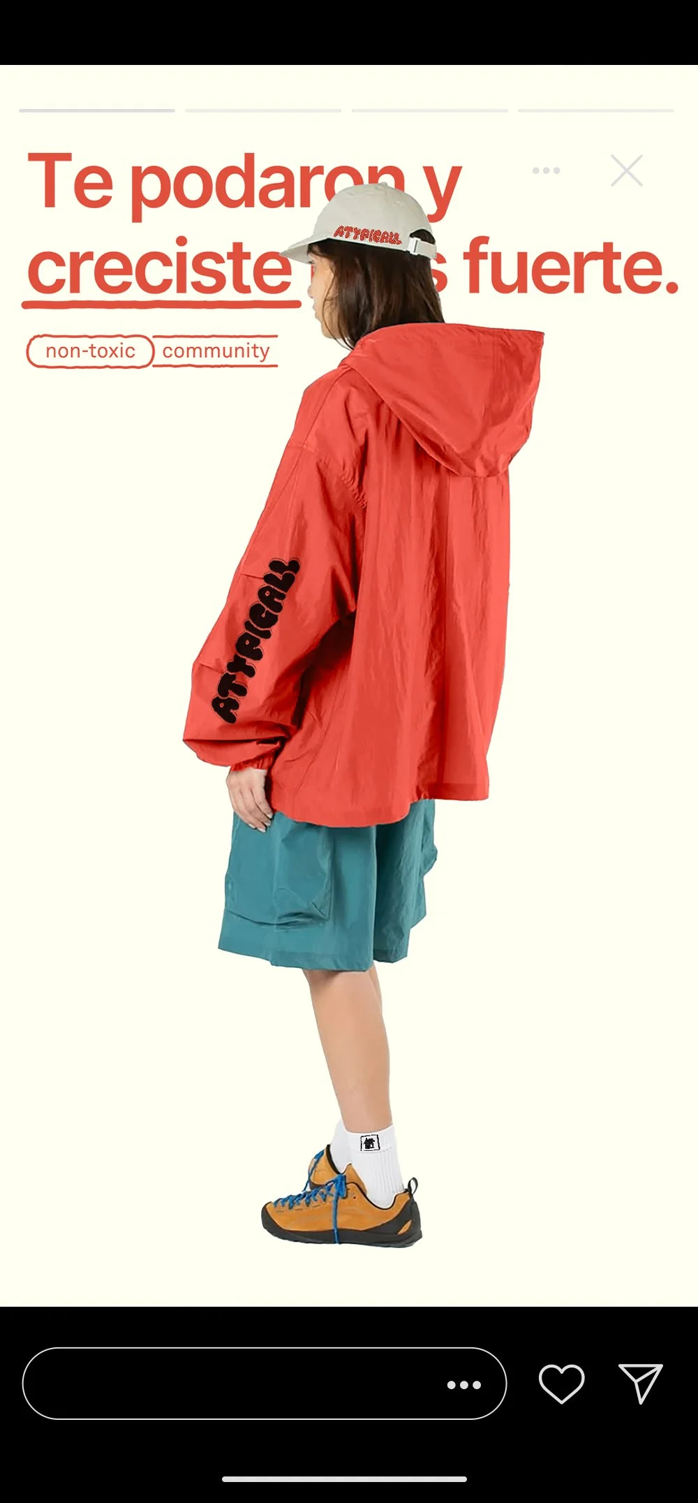
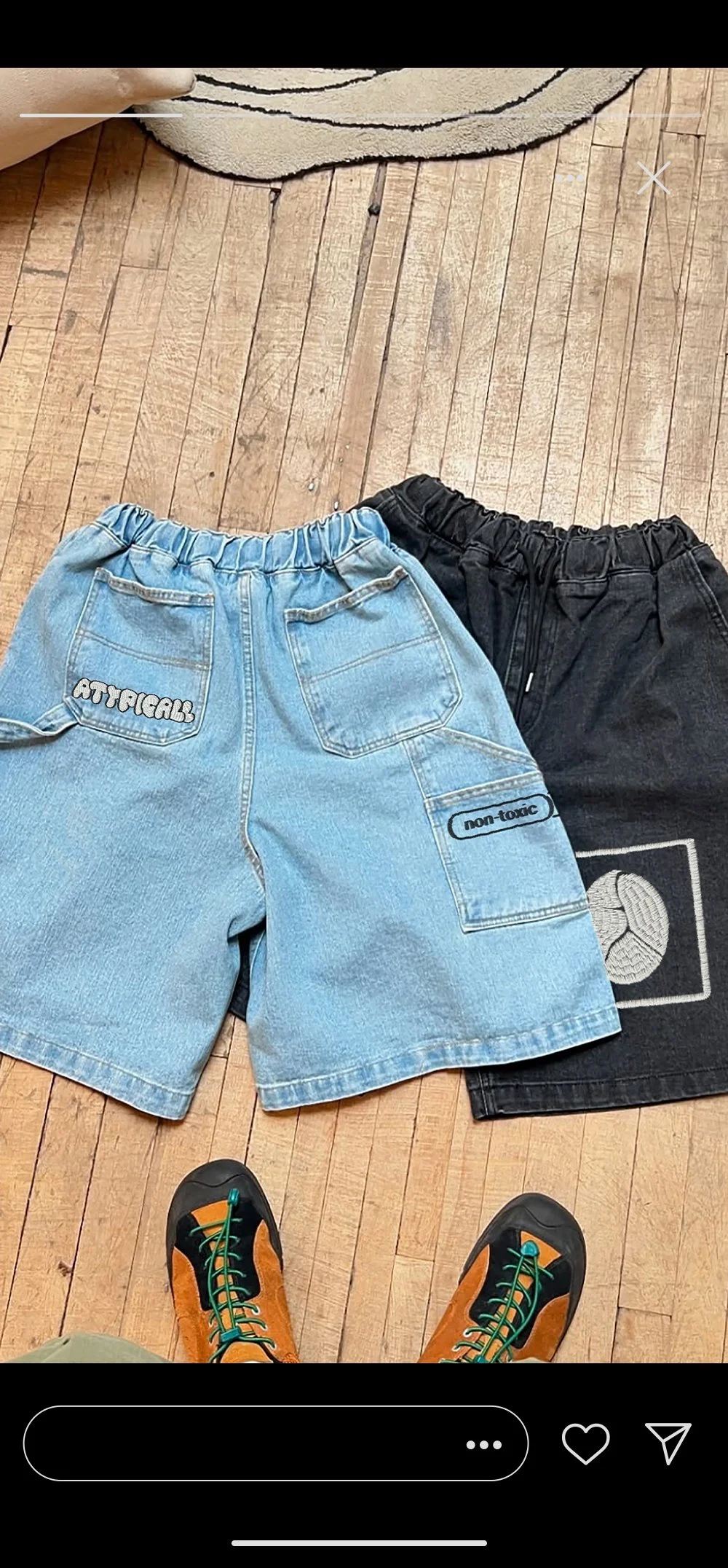
Our stories are where the merch comes to life. We use this space to show how each piece can be worn, combined, or reimagined — always from a personal, emotional perspective. It’s not about fashion rules, but about how the clothing feels, what it says, and the stories it tells when it becomes part of someone’s everyday.
Instagram Stories
*
Instagram Stories *

Atypicall is not a brand that asks for attention — it holds space.
It’s for those who move a little differently, who feel deeply, and who often stay quiet in loud rooms.
This project is a reminder that design can do more than communicate — it can comfort, connect, and create belonging.
Because sometimes, all we need is a symbol, a phrase, or a shared silence to feel seen.